
KaligentOne
SaaS company creating software to help integrate clinical, molecular and pathology data to better manage patient care, outcomes, and clinical decisions.
Company: Kaligent (Part of Tgen)
Project Type: Desktop Application
Timeline: Started on June 2023 to September 2024
My Role: Lead UI/UX Designer & Product Designer
Main areas of responsibility:
- Management, sprint planning, task assignments, weekly reviews. Research for market requirements and for competitors.
- UX analysis like defining the user persona, conducting usability with real users, flows, and conducting user research.
- Design user interfaces.
- Create wireframes and Prototypes. Maintain design systems.
Tools Used: Figma, Zoom, Adobe Illustrator, Confluence and Jira Board apps.
The problem
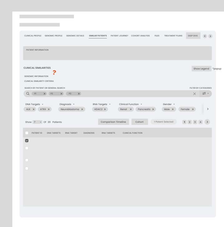
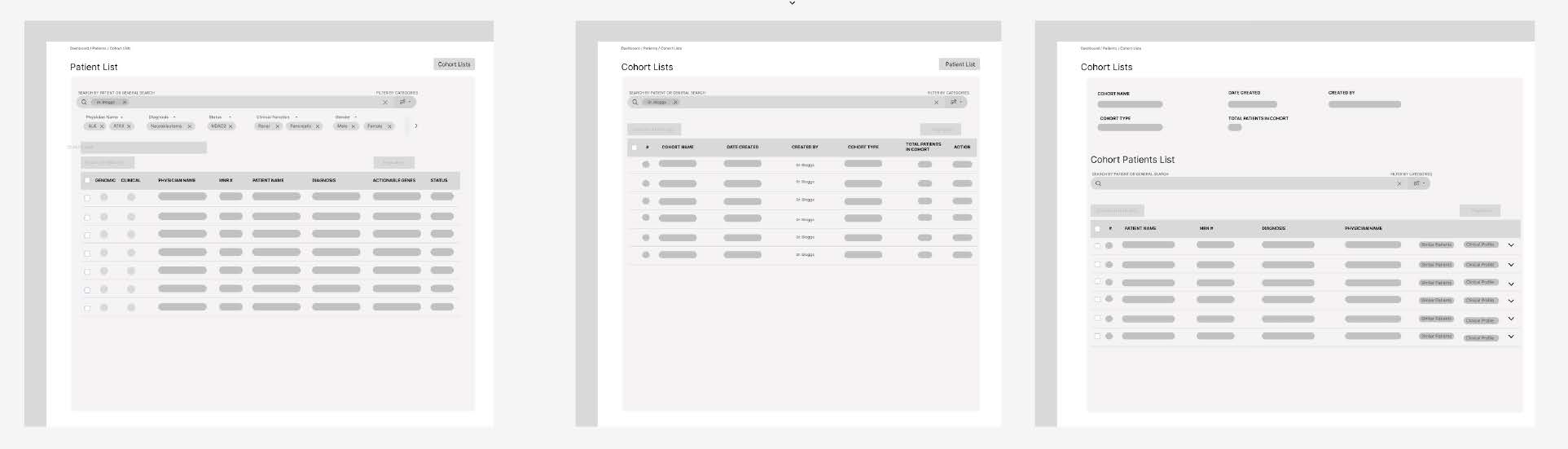
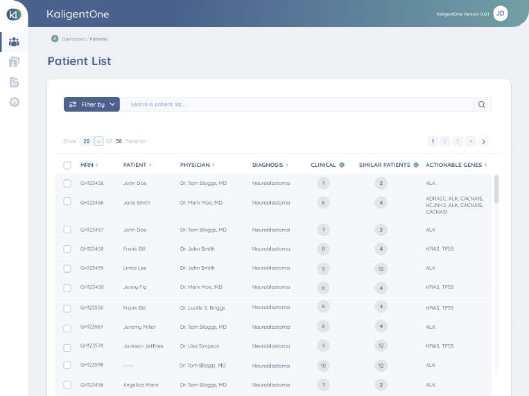
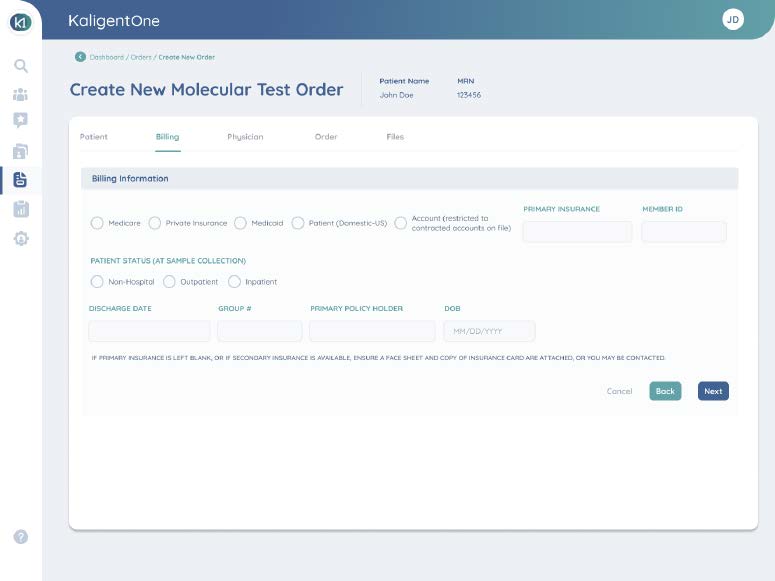
The company was tasked with introducing its first Precision Medicine Portal System designed for oncologists, aiming to streamline the way patient information is accessed and managed in oncology settings. The primary challenge was to create a system that was not only easy to use but also efficient, as oncologists typically have very limited time—usually no more than 20 minutes—to conduct routine check-ups. This meant the system needed to surface the most relevant patient data quickly, enabling healthcare providers to make critical decisions with ease and speed.
The system had to meet several key requirements:
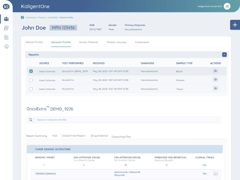
- It needed to offer quick access to patient histories, including data from initial visits, ongoing treatments, and the evolution of patient health over time.
- Given the complexity of oncology care, the solution had to integrate seamlessly with various laboratory and insurance company platforms, as well as hospital administration systems, providing a comprehensive view of the patient’s treatment journey across multiple touch points.
- Additionally, the system needed to evolve in order to provide patients with access to their consultation notes, treatment plans, and the results of laboratory tests and studies.
This not only aimed to improve the efficiency of medical practitioners but also to enhance patient engagement by offering transparency and easy access to their own health data.
Research and Insights
Collaboration and Understanding the Product
To ensure a thorough understanding of the product and its requirements, we conducted daily meetings with key stakeholders including the Design Team, Business Analysts, Product Owner, Stakeholders & developers. These meetings helped align the project goals as well as clarify priorities and establish a collaborative workflow across all teams.
Your Attractive Heading
We conducted interviews with oncologists to gain insight into their
workflows, patient interactions and how they collaborate with colleagues.
These conversations provided valuable information about their pain points,
preferences & daily challenges in managing their tasks effectively.
Surveys and User Testing
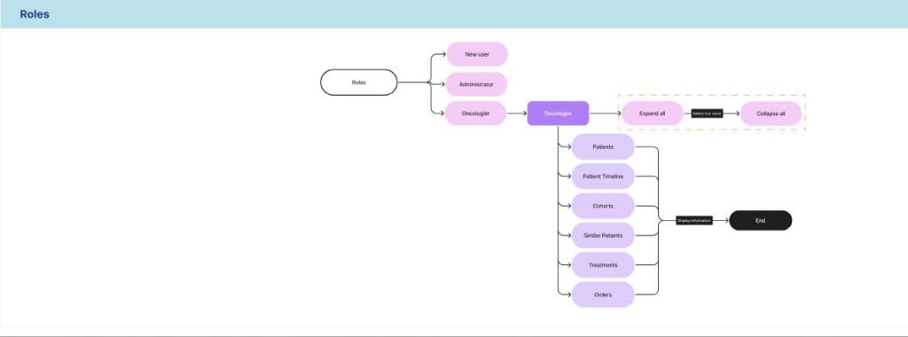
We engaged with six participants for surveys and user testing: four oncologists and two hospital administrators. This mixed user base allowed us to uncover critical differences in how the system would be used by different roles:
- Oncologists: The oncologists expressed frustration with information overload when too much data was displayed on a single page. They noted that this layout often resulted in wasted time searching for specific details. They preferred content divided into clearly defined sections or pages for easier navigation and quicker access to the information they needed.
- Hospital Administrators: In contrast, hospital administrators preferred having all essential information consolidated on one page. This reduced the need for excessive clicking and allowed them to complete their tasks more efficiently.
These findings helped us identify the need for a role-based interface that caters to the distinct needs of both user groups.
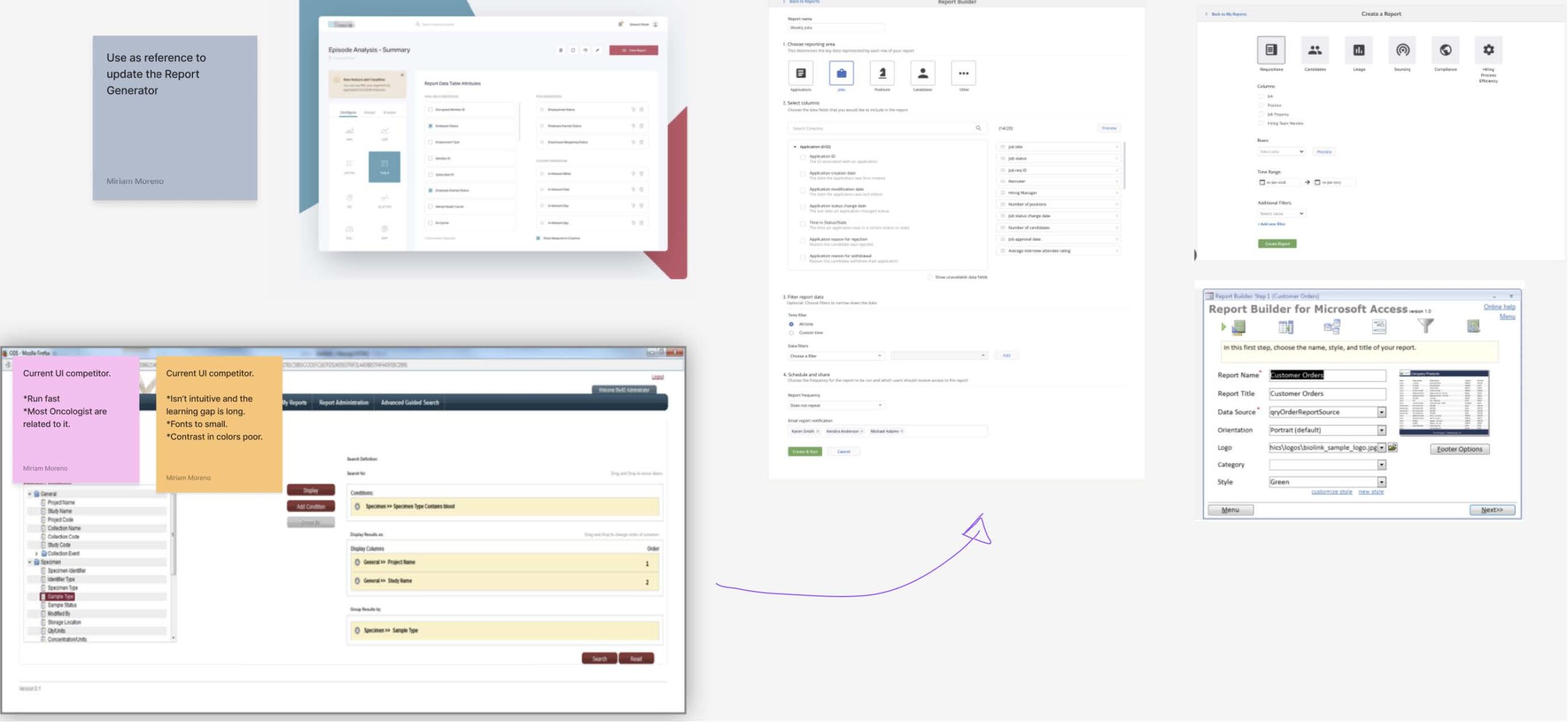
Competitive Analysis
We performed a detailed analysis of two direct competitors in the field. This process revealed several pain points in their systems that we could address including:
- Overwhelming and cluttered layouts that hindered usability.
- Lack of an intuitive design, which made it difficult for users to identify and execute necessary actions.
By addressing these issues, we aimed to create a more visually appealing and functional design that simplifies the user experience and improves task efficiency.
Your Attractive Heading
- Role-Specific Design: The research underscored the importance of creating a tailored experience for different user roles. Oncologists needed segmented interfaces, while hospital administrators required a consolidated view.
- Simplified Navigation: Both user groups valued intuitive navigation to minimize time spent searching for information or performing routine tasks.
- Enhanced Visual Appeal: A cleaner, more organized design could improve usability and help users quickly locate and execute actions, especially compared to competitors.
These insights formed the foundation of our design decisions and allowed us to prioritize features and functions that addressed the distinct needs of both oncologists and hospital administrators.
The Solution
Collaborative Workflow and Prioritization
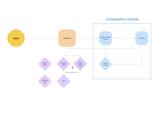
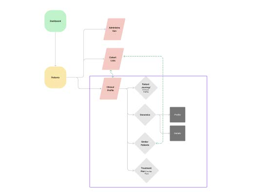
Working closely with the Product Manager, Business Analysts, Development Team, and Design Team, we defined a complex system architecture and detailed workflows for each user type.
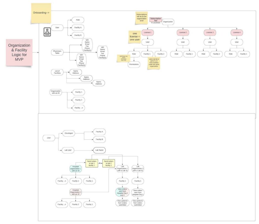
Through collaborative discussions, we prioritized features to ensure that the most critical user needs were addressed first, aligning with development timelines and technical feasibility.
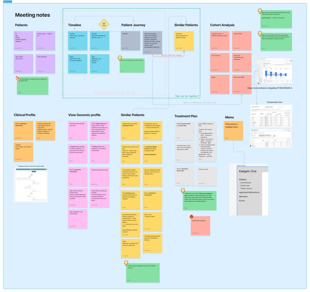
Design Iteration and Refinement
As the Design Team, we underwent numerous iterations to ensure the interface was not only functional but also visually appealing and user-friendly. After each wireframe, revisions were made to optimize performance and usability for each feature. This iterative process allowed us to fine-tune the system to meet user expectations.
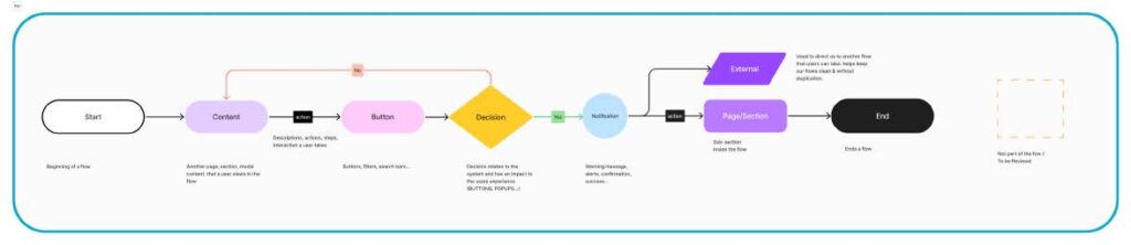
UI Guidelines and Asset Management
The creation of comprehensive UI guidelines was essential due to the wide variety of buttons, inputs, and other assets required by the system. This effort ensured consistency across the interface while maintaining the flexibility needed to support diverse user workflows.
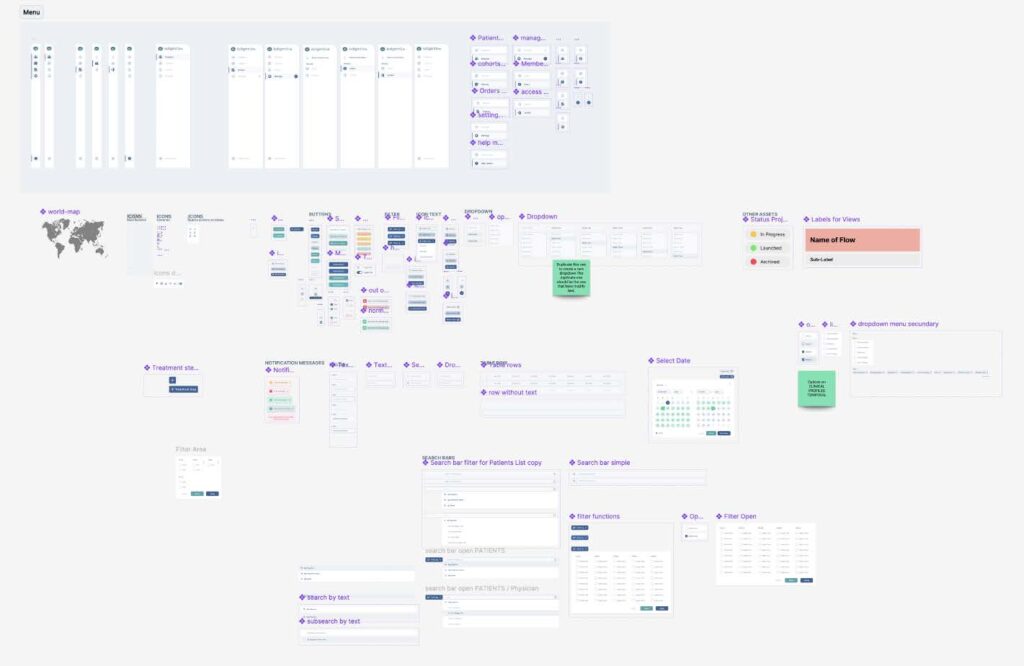
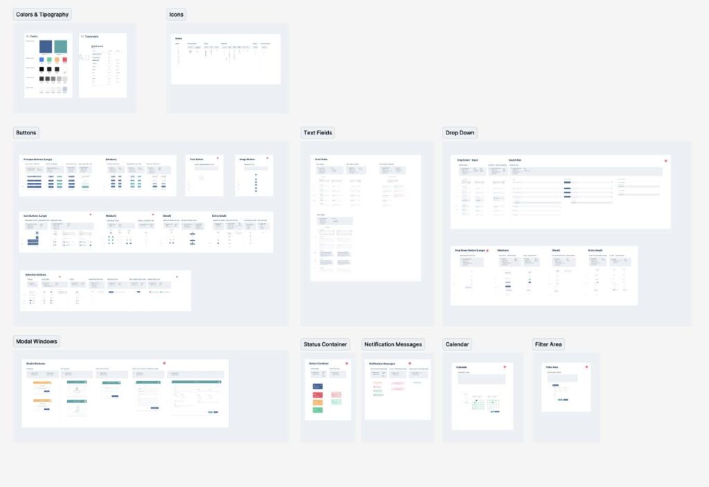
Despite the complexity, the guidelines became a critical resource for developers and designers to deliver a cohesive user experience.

Incorporating Feedback for Updates
Feedback from oncologist users played a crucial role in shaping updates to make the UI more user-friendly. Based on their input, we identified areas for improvement and worked closely with the Product Manager in long meetings to develop updates tailored to their needs. These enhancements aimed to further streamline their workflows and ensure a seamless user experience for future versions of the system.
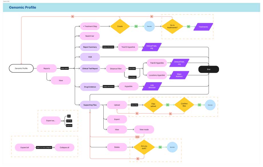
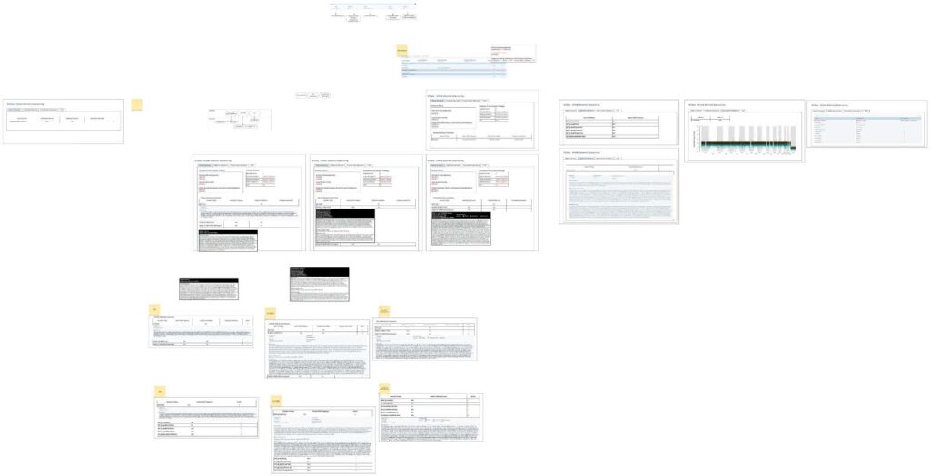
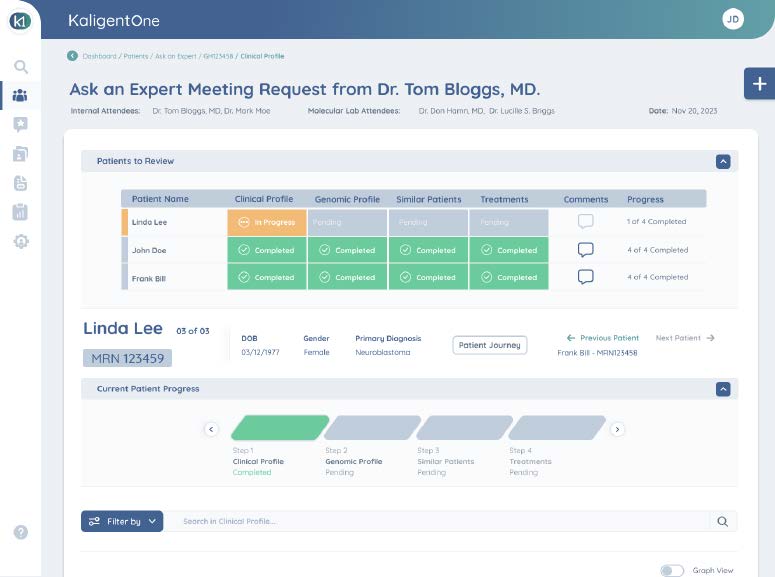
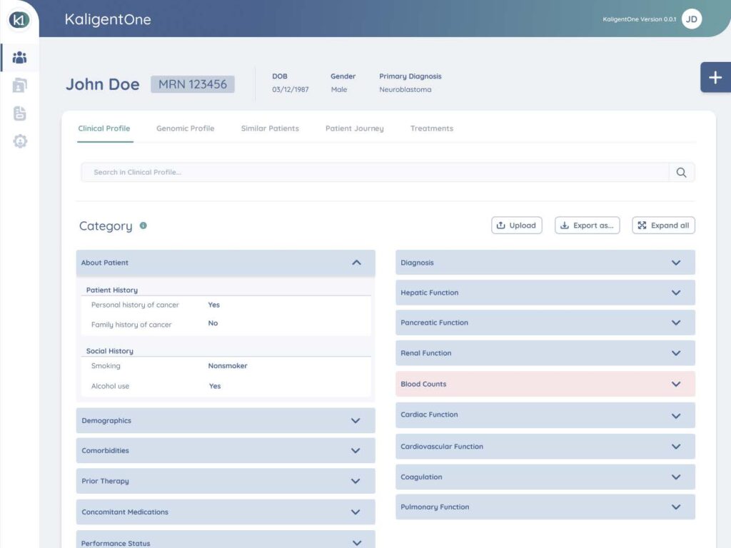
Clinical Profile Section V1.0
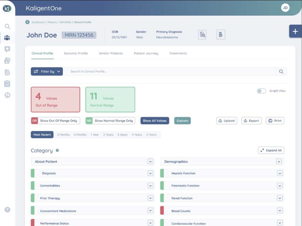
Clinical Profile Section V3.0
Results and Impact
Your Attractive Heading
When Version 3.0 of the system was launched and installed, users reported
a high level of satisfaction. They found the system easy to understand and
quickly adapted it to their daily workflows. Oncologists appreciated the
role-specific interface that streamlined their tasks, while hospital.
Adoption and Testing Phase
At the time of writing this case study, the system has been in operation for less than three months and remains in the test phase. Despite its limited runtime, early feedback indicates that the design choices successfully addressed the users’ needs, providing a solid foundation for further refinement and scaling.
Initial Outcomes
- Enhanced user satisfaction due to intuitive navigation and tailored interfaces.
- Faster onboarding and adaptation to the system by both oncologists and administrators
The ongoing testing phase will continue to gather valuable insights to optimize the system further, ensuring it remains user-centered and effective in the long term.