BioSoft Integrators: Visual Identity & Design Ecosystem
Identity Evolution:
Synthesis and Brand Redesign
| Before | After | Value Proposition |
| Complex, detached helix | Helix integrated into the letter ‘B | Synthesis and Cohesion: We transformed fragmentation into a monolithic symbol representing the total integration of data and biology. |
| Distracting typography (circular dot) | Clean and balanced typography | Clarity and Professionalism: Optimized legibility to project the technical rigor of a laboratory and HPC (High-Performance Computing) environment. |
| Flat and generic colors | Subtle, professional gradients | Innovation and Fluidity: Communicating the transition from raw data to genomic insights through a modern and professional palette. |
Brand System and Style Guide
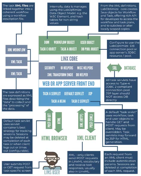
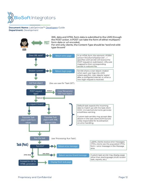
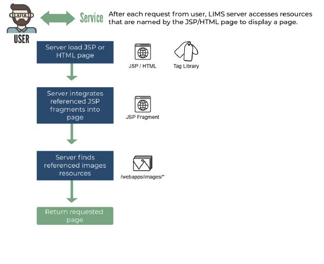
The challenge for BioSoft Integrators was not just aesthetic, but regulatory. We designed a comprehensive Brand Bookthat serves as the “IT backbone” of the brand. The visual system ensures identity integrity across critical software interfaces (LIMS) and high-performance hardware (HPC).


Key execution points:
Sub-brand Architecture: Established clear guidelines for specific applications like CropWerx, integrating color palettes that differentiate services without losing institutional cohesion.
High-Performance Typography: Selected font families such as Montserrat and Open Sans to ensure readability in data-dense environments, reinforcing an image of reliability and professionalism.
UI/UX Functionality: The manual defines the use of interface elements (buttons, active states, system typography) to ensure the software is as intuitive as it is powerful.


Complete Brand book
Digital Communication with Scientific Purpose
The social media challenge for BioSoft Integrators was translating the technical complexity of LIMS and HPC systems into accessible, visually striking, and human messages. We implemented a content strategy based on three pillars: Education (BioSoft Facts), Social Awareness, and Critical Solutions.


Visual Strategy Pillars:
- BioSoft Facts: A series of informational “capsules” highlighting the power of HPC infrastructure and software development under ISO 9001:2015 standards, using a typographic hierarchy that prioritizes key data.
- Context and Relevance: Specific alerts for LIMS solutions in SARS-CoV-2 testing, projecting agility and connectivity during high scientific demand.
- Brand Responsibility: Integrated identity into global health dates (Alzheimer’s, Vaccination, Disability), using photographic compositions that connect technology with human well-being under the hashtag #WeAreBioSoft.

Comprehensive Documentation:
Client Tools and Internal Development Guides
During my tenure at the company, I led the creation of a documentation ecosystem that bridges the gap between commercial vision and technical execution. The goal was to provide BioSoft Integrators with tools that project technological maturity to both the market and their own engineering teams.
Technical Implementation Guides & Infographics:


Digital Corporate Brochure: A strategic editorial piece breaking down Track (LIMS), Analyze (HPC), and Code (Software) services, facilitating the sales process for high-complexity services.
“Your Lab, Your Way” Narrative: Implemented customer-centric language to communicate the flexibility and scalability of our genomic solutions.