
LOGOS
LOGOS
LOGOS
LOGOS
LOGOS
LOGOS






BRANDING
BRANDING
BRANDING
BRANDING
BRANDING
BRANDING

BioSoft Integrators Branding
A deep dive into the corporate rebranding and visual system redesign for BioSoft Integrators. Explore the design evolution—from integrating the DNA helix into the core monogram and modernizing technical user guides to deploying comprehensive brand collateral across print and digital touchpoints.

Kaligent Branding
A deep dive into the corporate rebranding and visual system design for Kaligent post-acquisition by TGen. Explore the design process—from initial DNA helix sketching and custom logotype development to structural iconography and comprehensive brand guidelines.
Brand Systems & Digital Content
Brand Systems & Digital Content
Client: Laura’s Nails
Role: Brand Refresh, Art Direction & Content Creation
Deliverables: Logo redesign, Brand Guidelines (One-Sheet), Photography, Video & Social Media System
Year: 2025
The challenge
Laura’s Nails had established a solid client base with high-quality technical work, but lacked visual cohesion online. Competing logo versions, inconsistent color choices, and scattered assets weakened brand recognition across digital channels. The objective was to eliminate visual friction, establish clear identity standards, and build a cohesive content system tailored for day-to-day operation.
The Approach
Pragmatic standardization over excessive guidelines: a versatile identity, an essential brand sheet, and in-house visual assets (photo and video) designed to highlight precision, clean technique, and a professional workspace.
1. Visual Foundation (Identity, Palette & Typography)
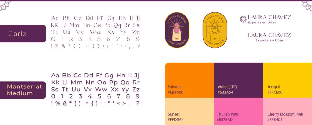
Unified Brand Assets
A refreshed logo optimized for digital touchpoints and watermarks, supported by a cohesive color palette and legible typographic hierarchy. All core rules were condensed into an accessible Brand Sheet to ensure effortless day-to-day consistency
2. Digital Touchpoint (Instagram Feed Overview)
Channel Cohesion
A structured feed framework balancing technical work showcases, key service details, and workspace atmosphere.
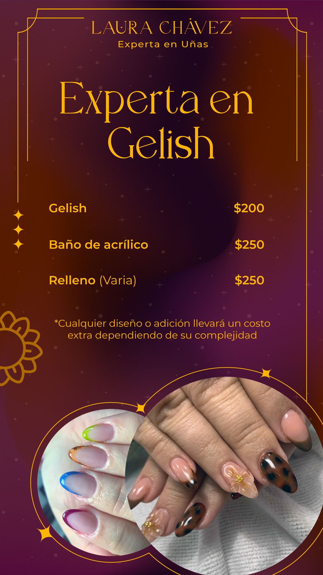
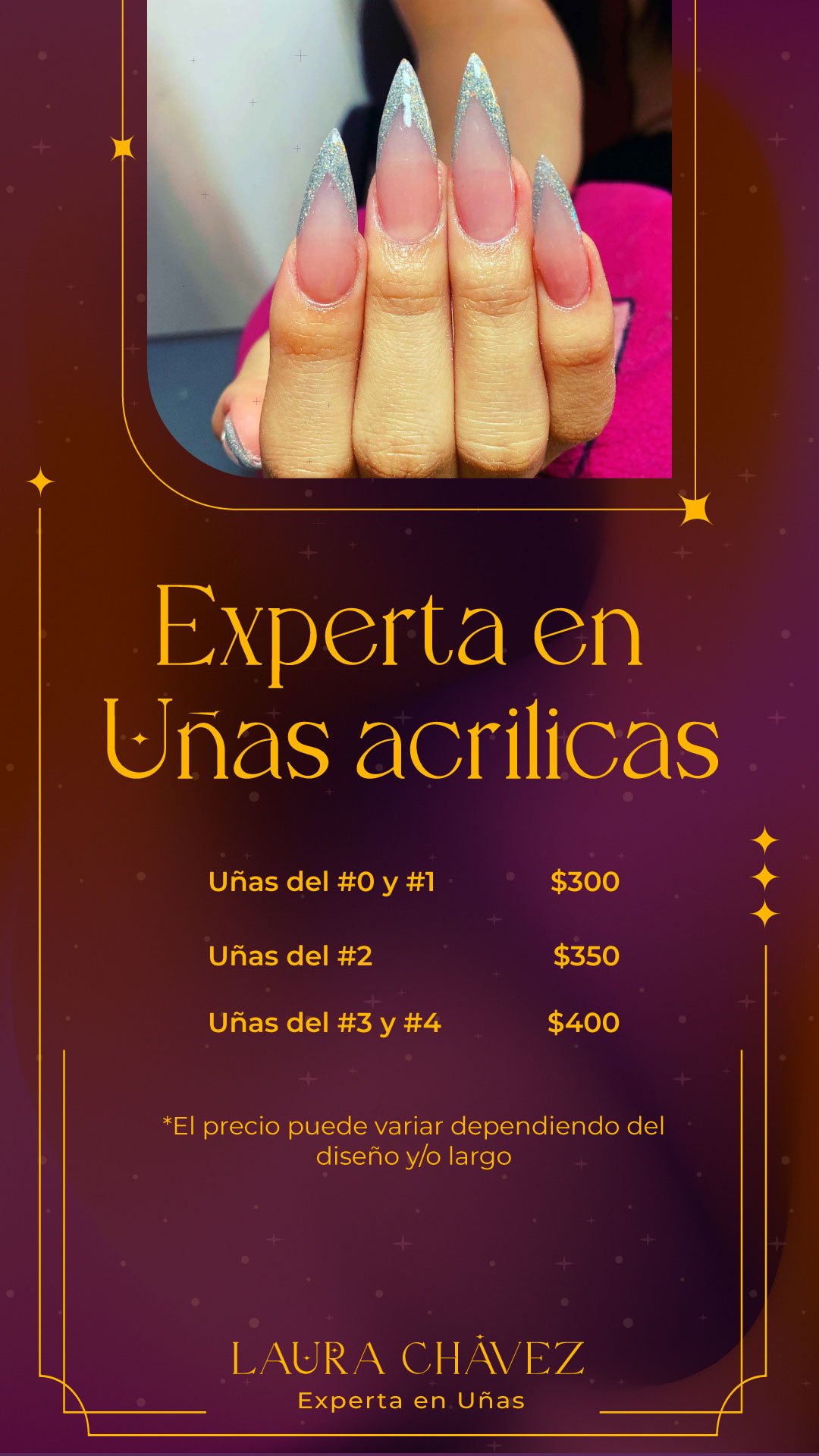
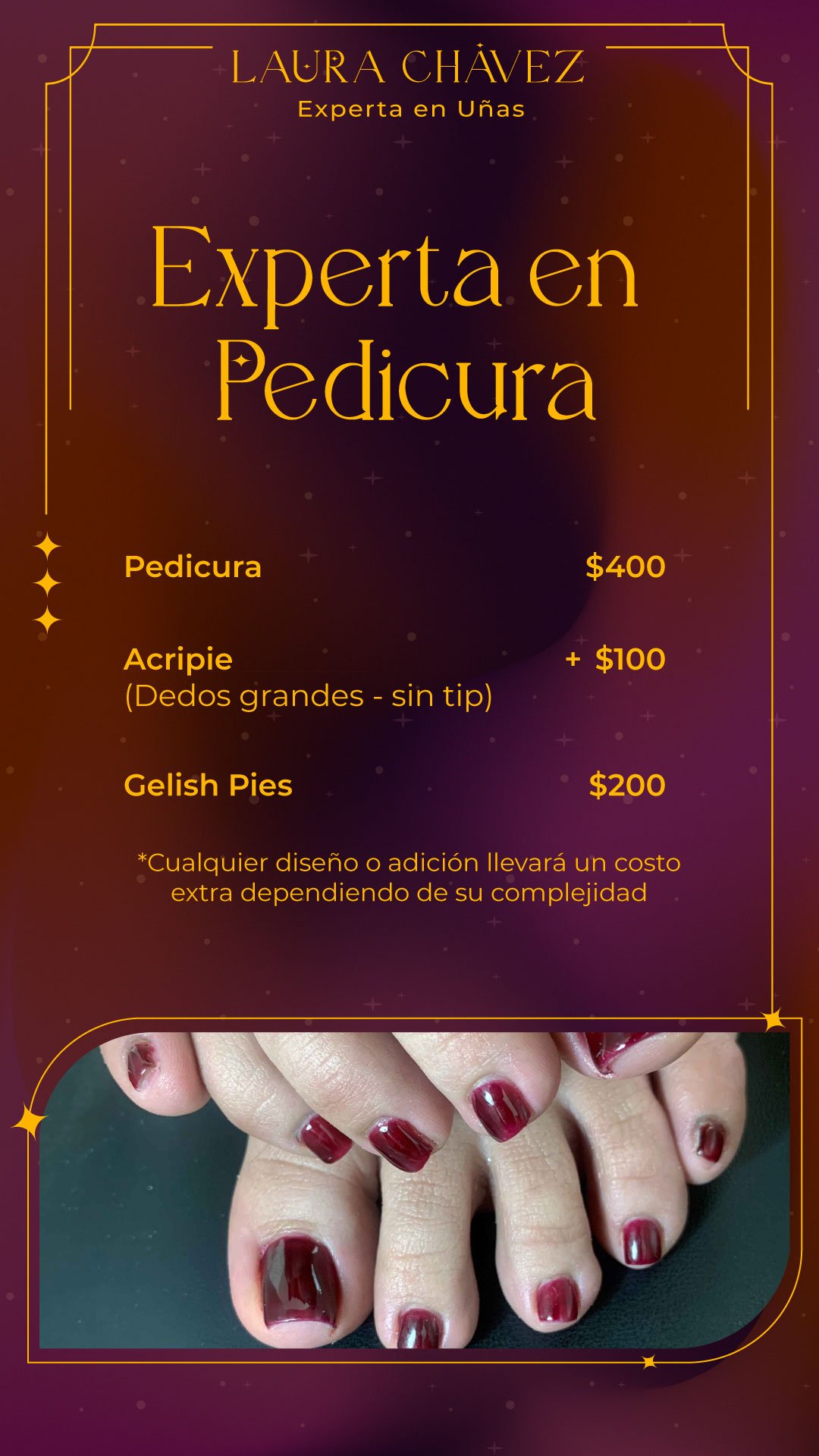
Highlight covers






Instagram static images post
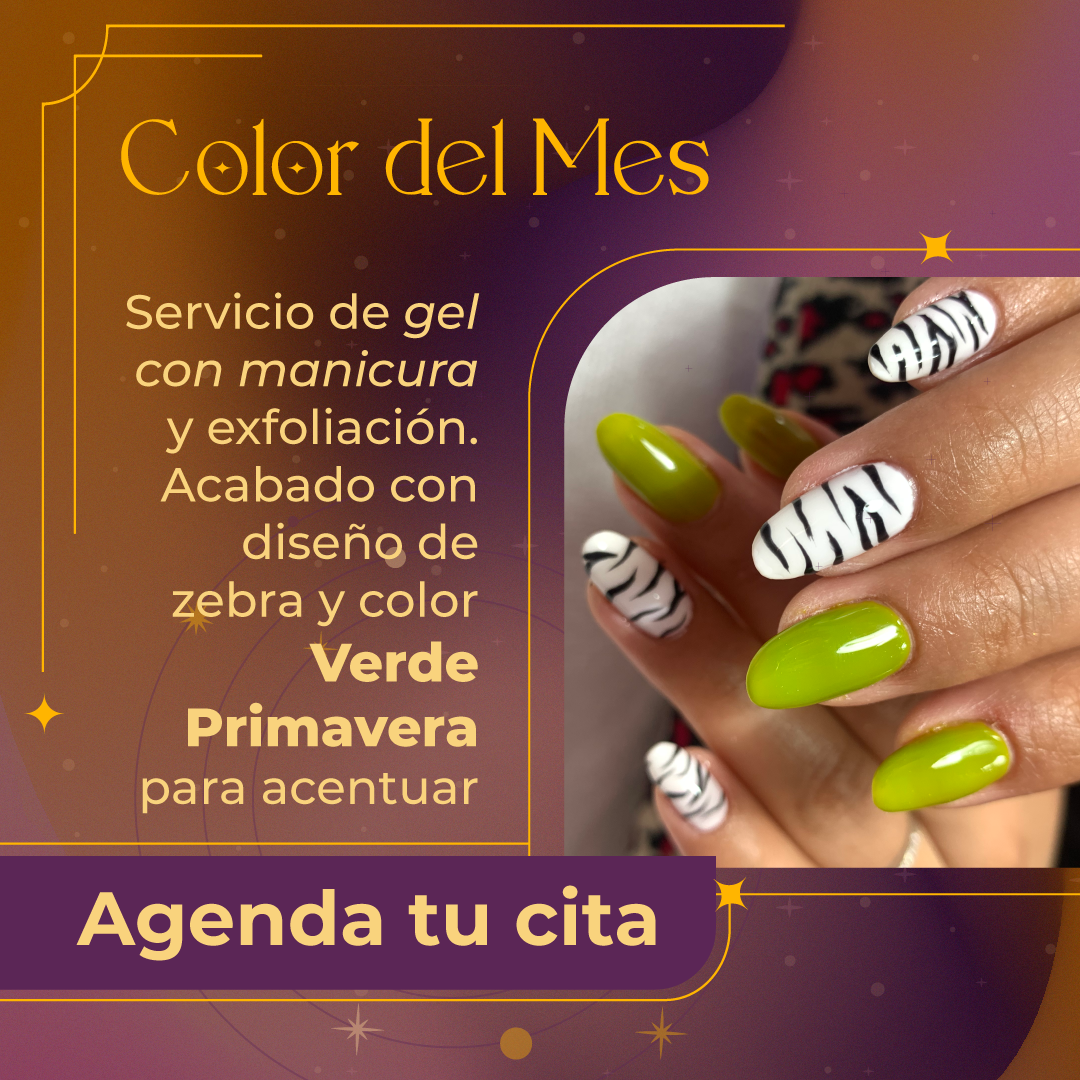
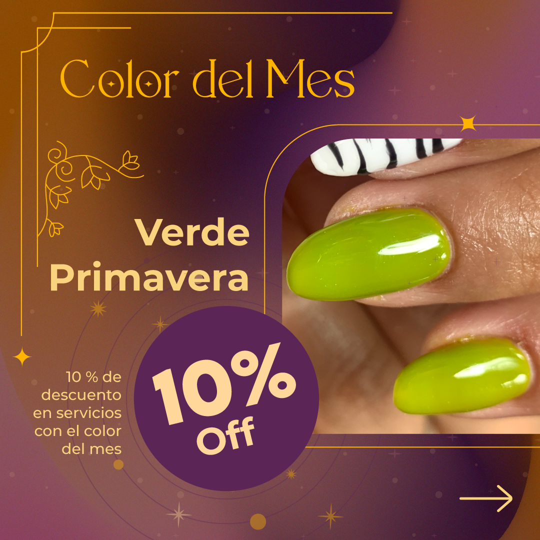
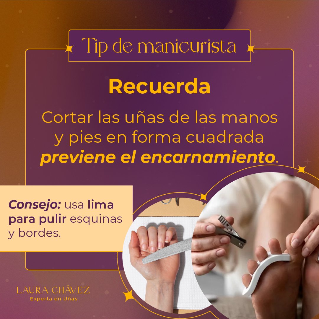
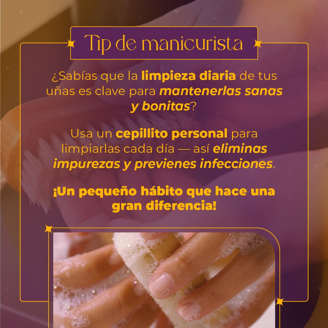
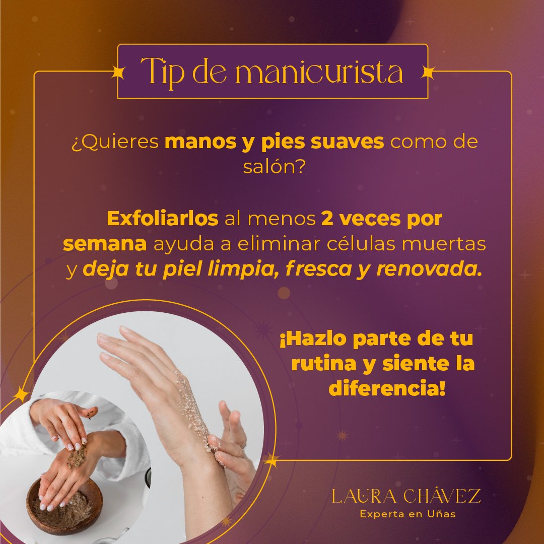
Instagram stories/highlight post
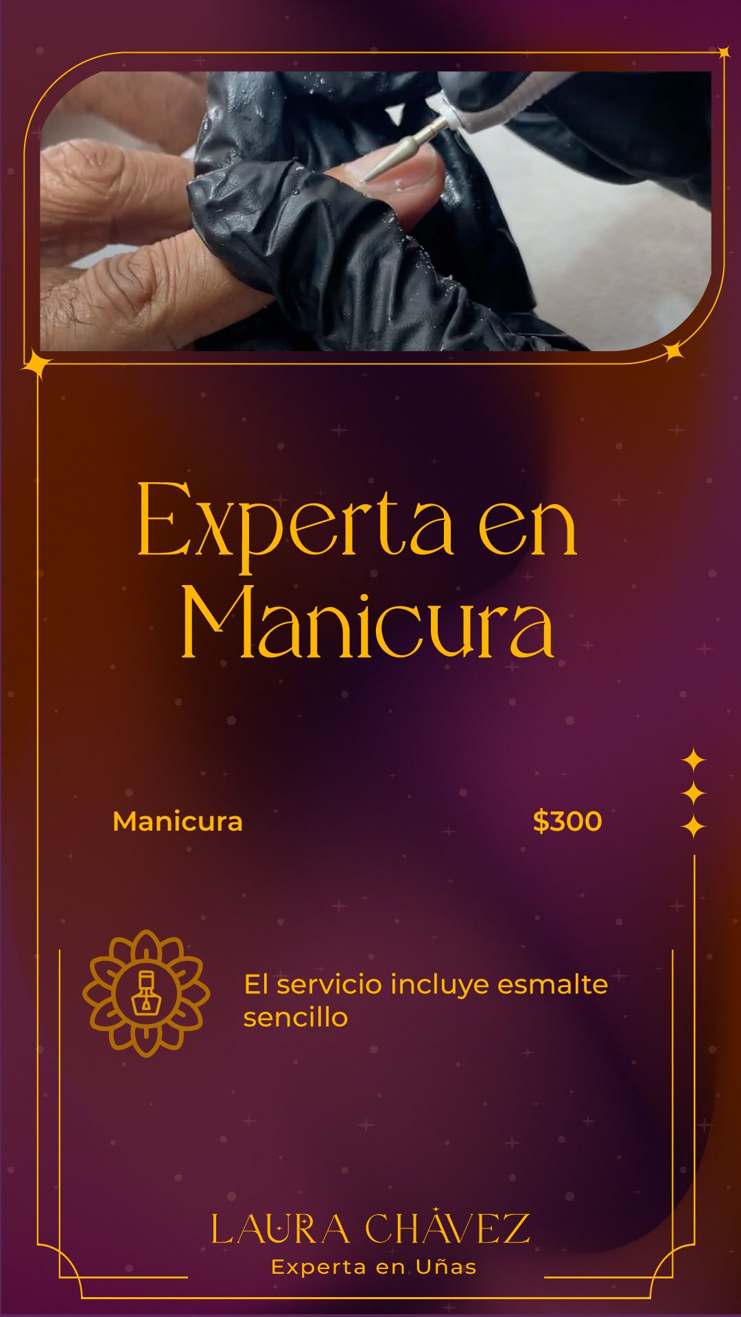
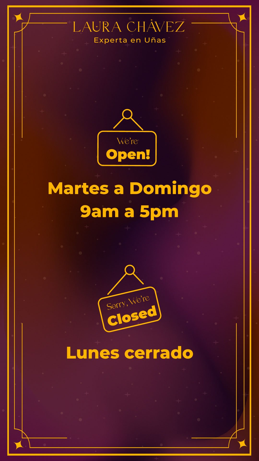
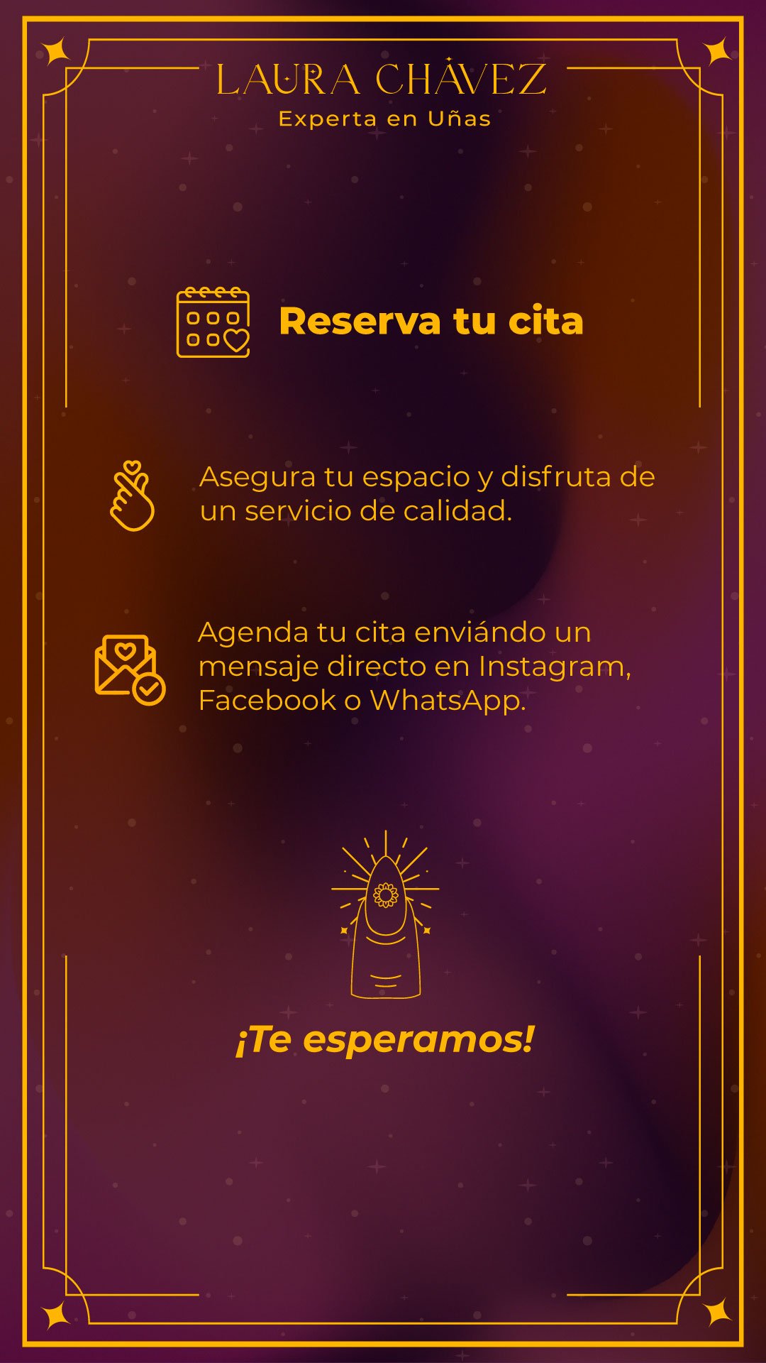
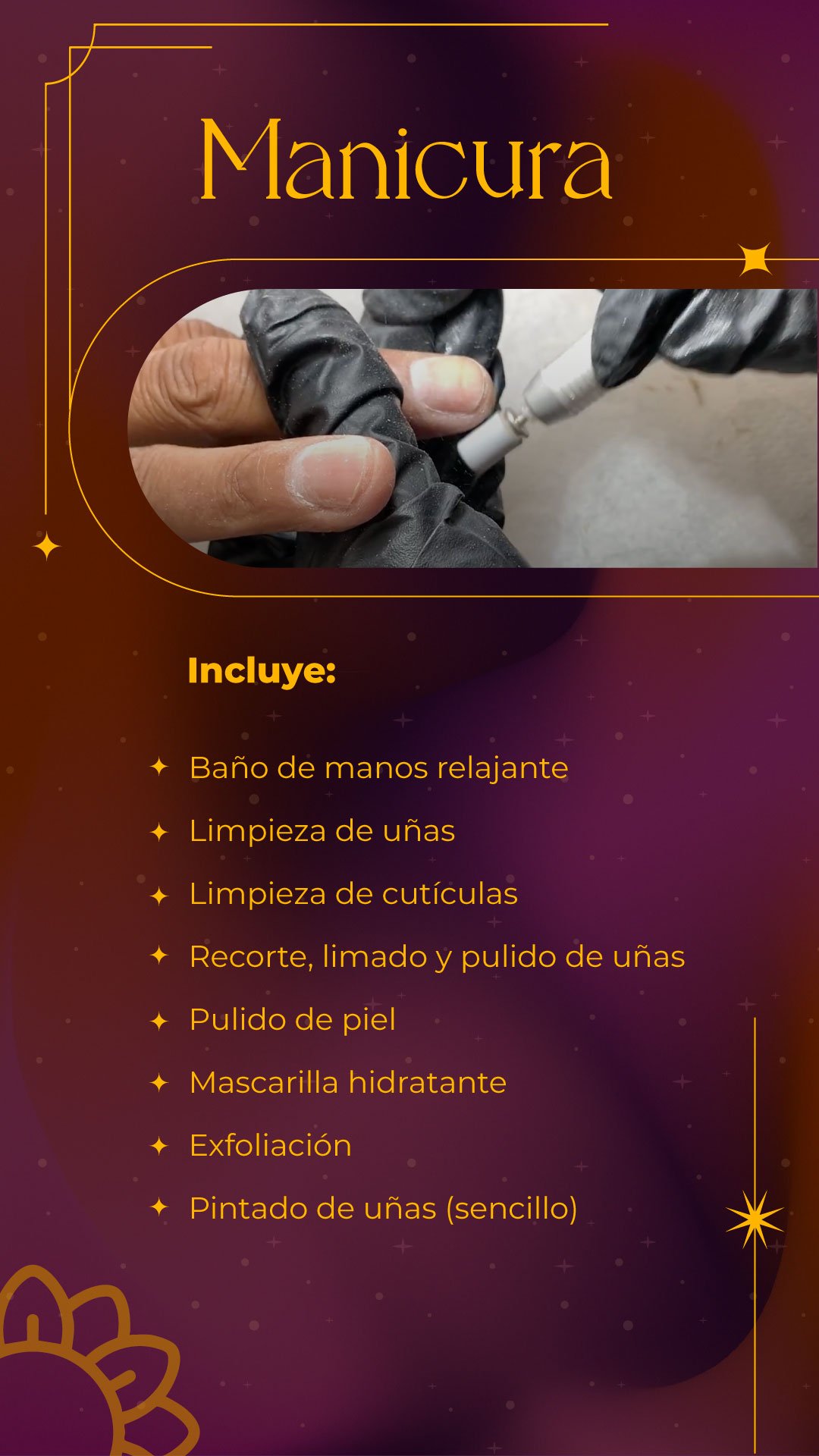
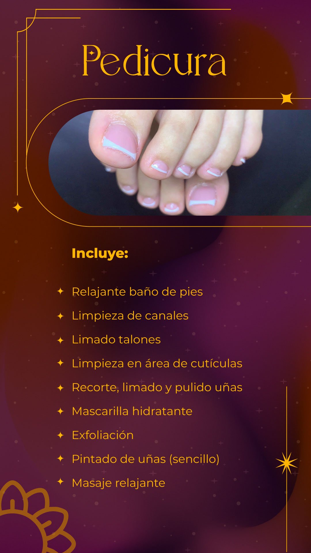
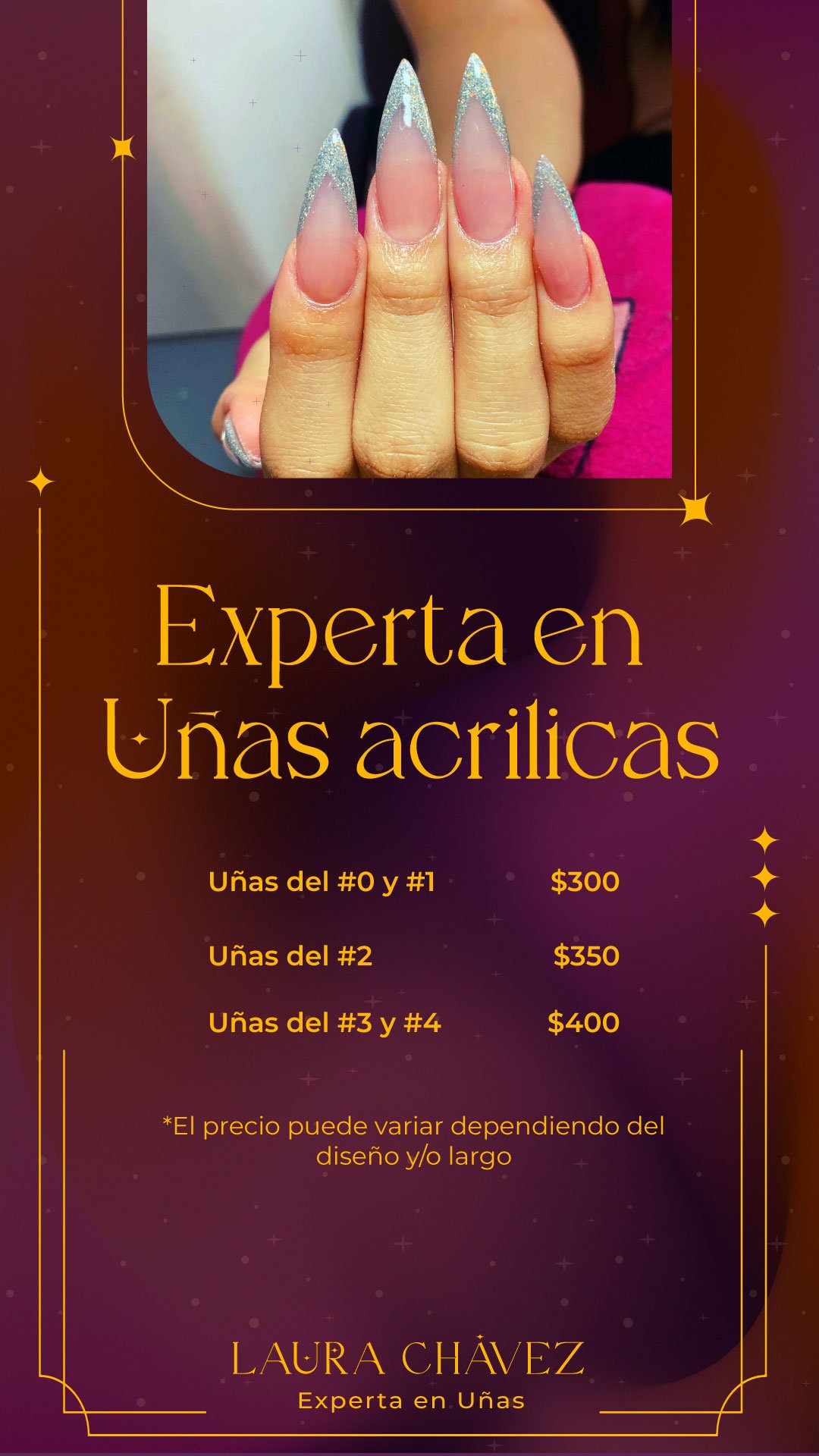
3. Dynamic Content & Process Video
Motion & Real-Time Technique Short-form process videos and reels crafted to capture textures, technique, and finished results in motion, optimized for fast-paced social engagement.
Role: Content Strategist & Visual/Motion Designer
Core Focus: Social Content Strategy, End-to-End Video Production (Short-form), Motion Graphics, Visual Assets
Tools/Formats: Short-form video (Reels/TikTok), Static & Carousel Design, Meta Ads
Content Strategy & Multimedia Design
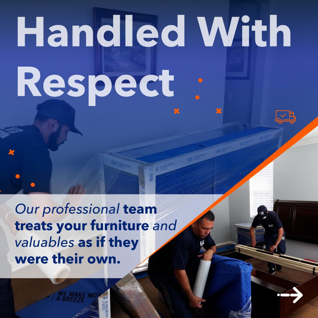
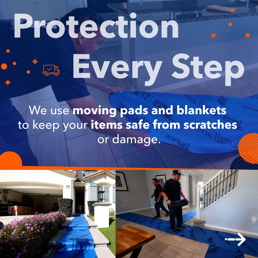
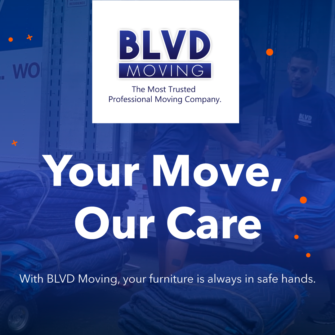
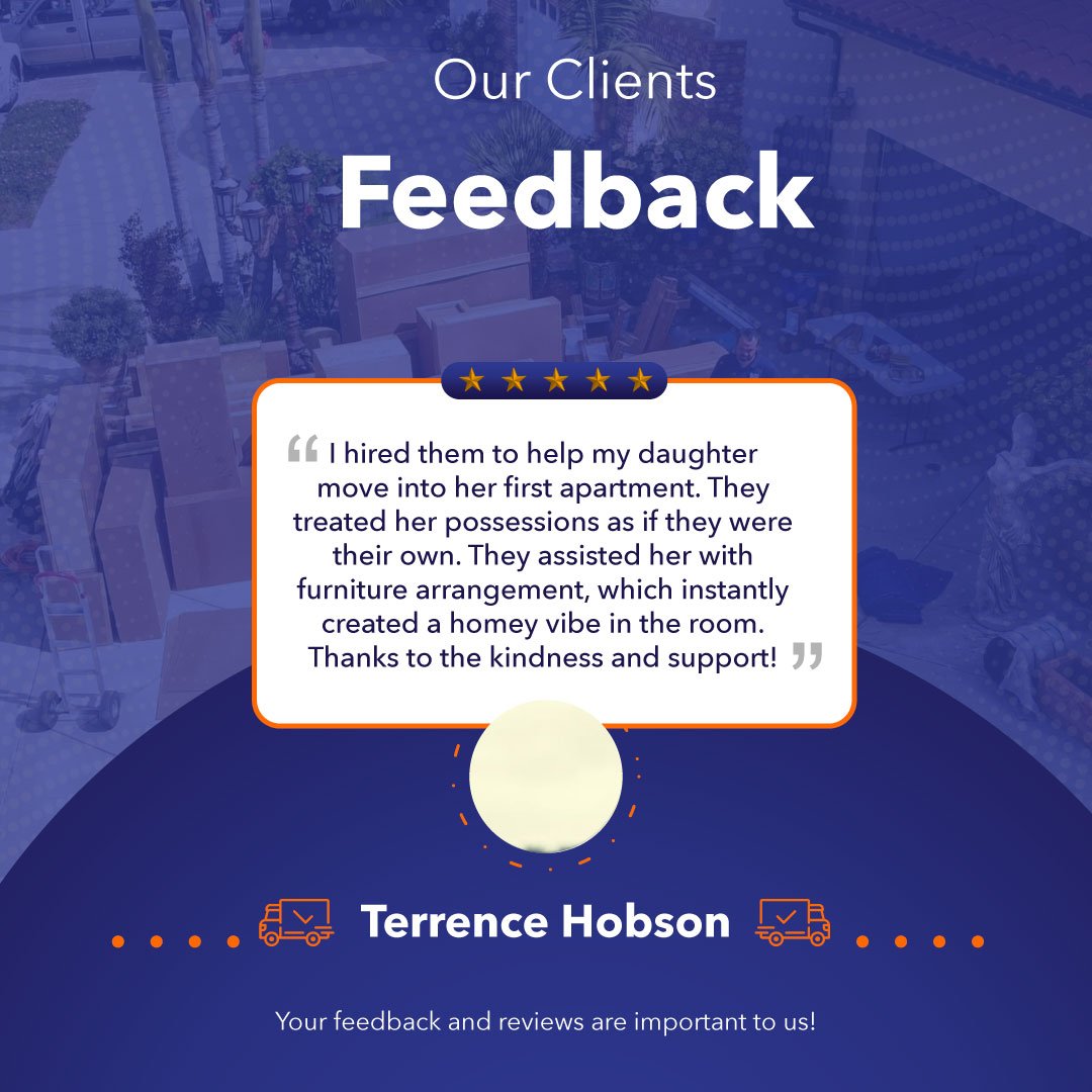
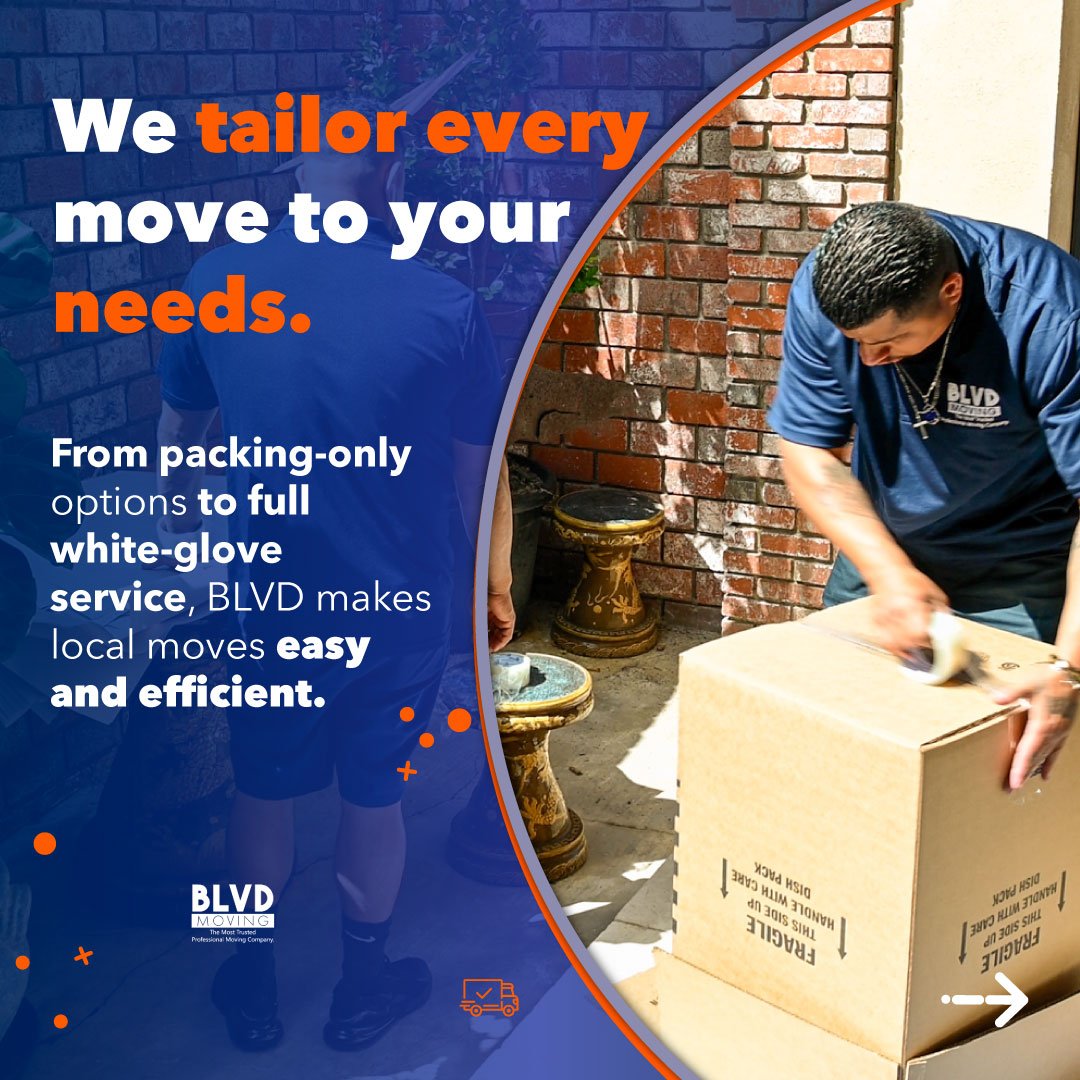
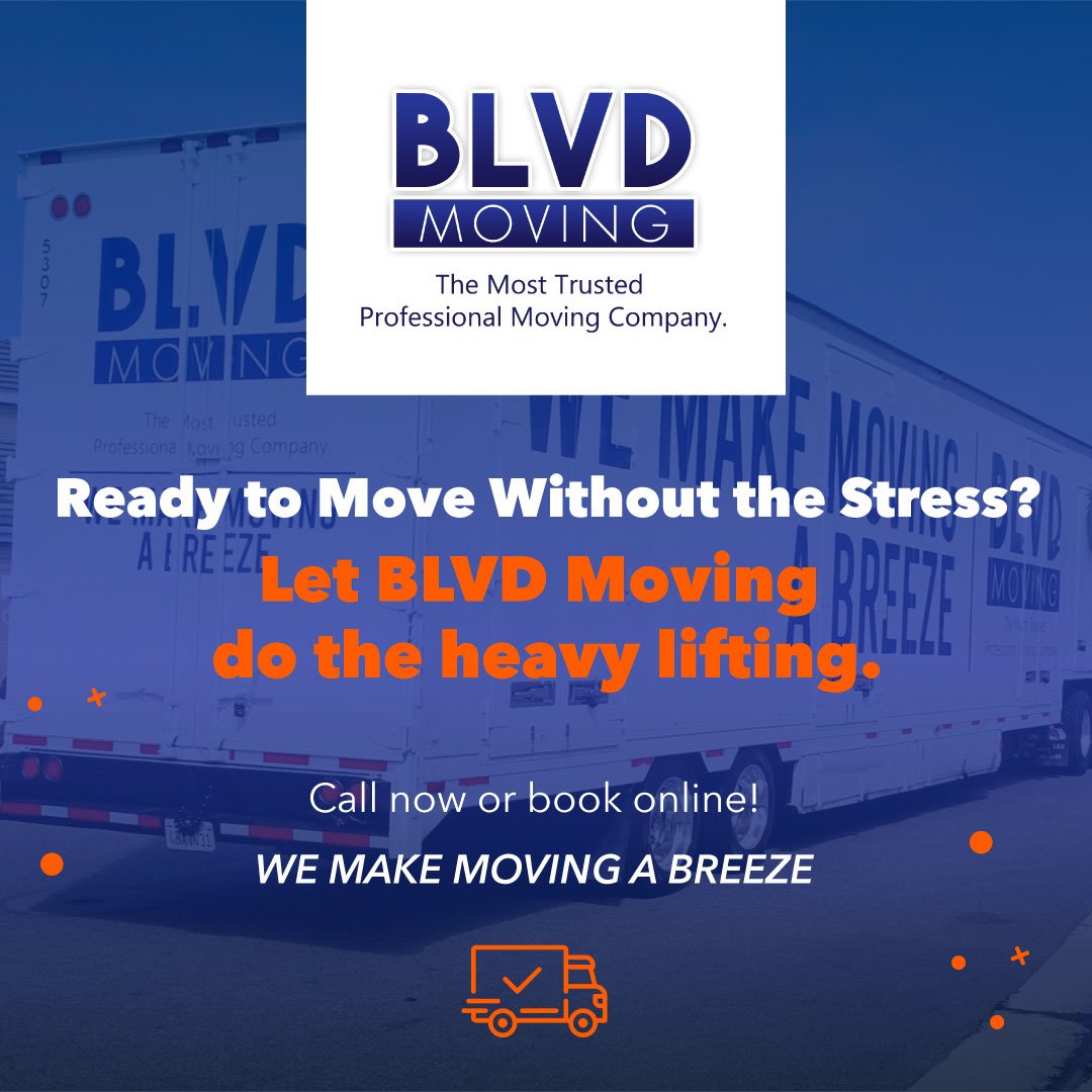
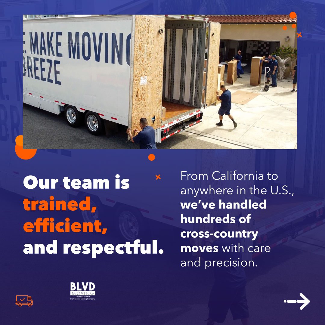
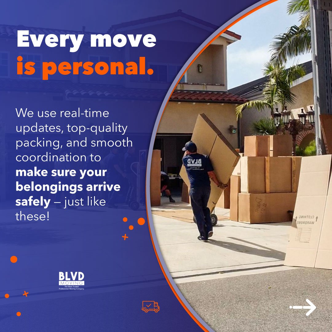
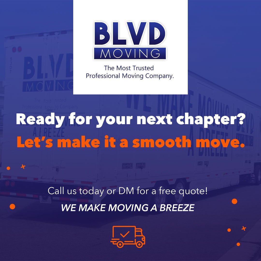
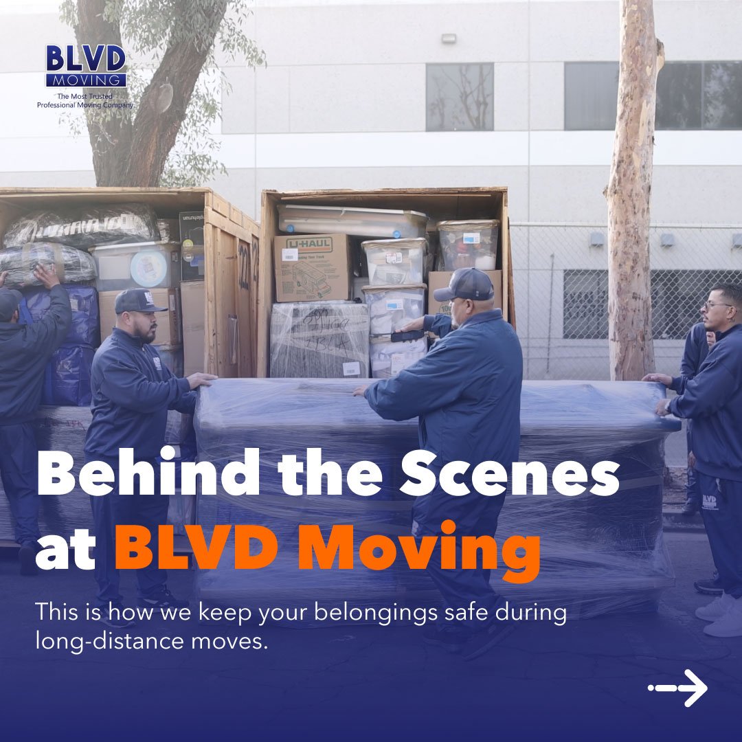
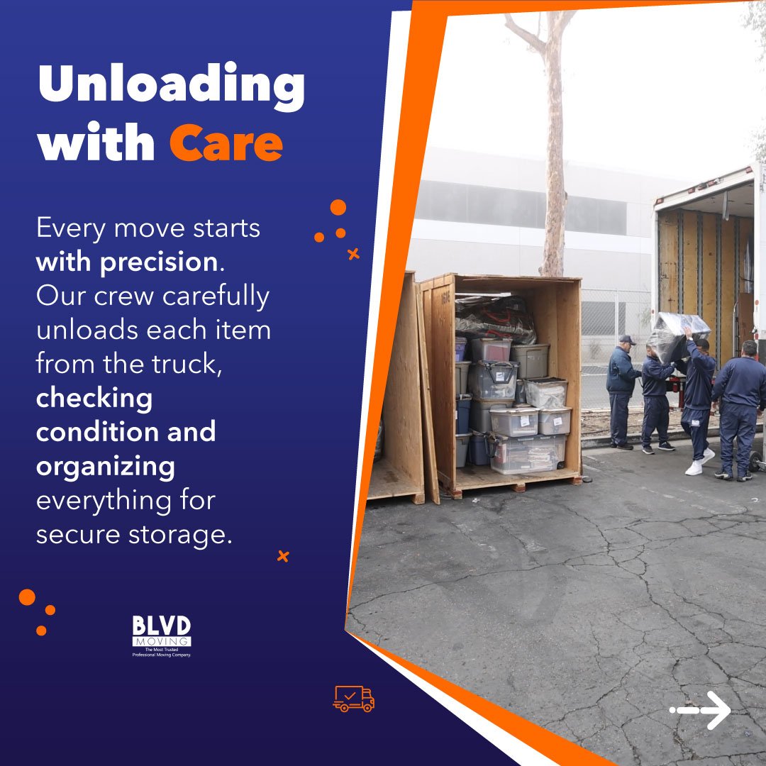
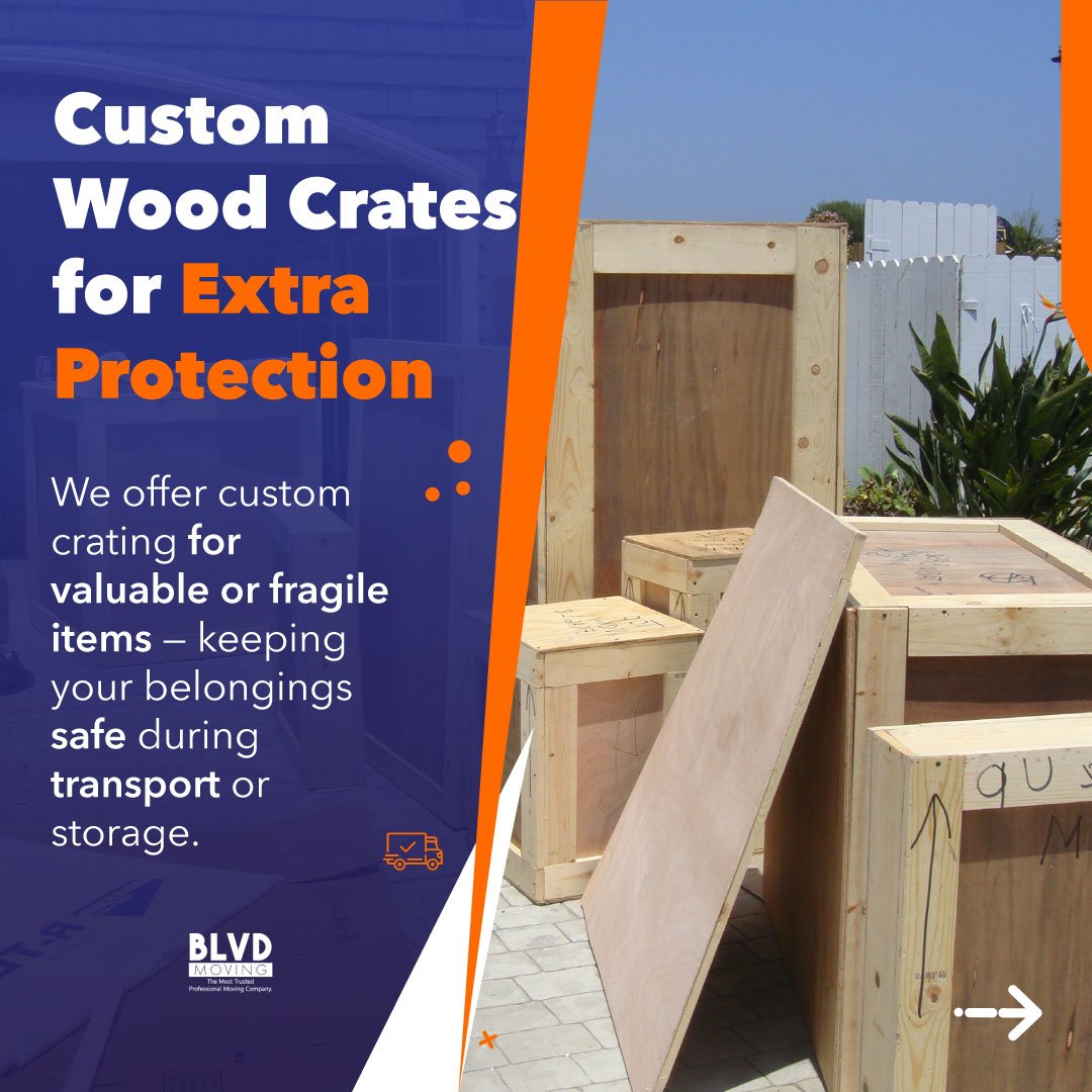
Led the end-to-end social content strategy and multimedia production for a California boutique moving company. Translated their existing brand identity into engaging, educational digital content—conceptualizing, designing, and producing all static visuals, motion graphics, and short-form video campaigns to de-stress the moving experience and drive customer trust.
Key Responsibilities & Deliverables:
- Strategic Content Pillars & Campaign Planning
- End-to-End Short-Form Video Production & Editing (Reels / TikTok)
- Social Media Graphic Design & Carousel Systems
- Lead Communication & FAQ Engagement Frameworks
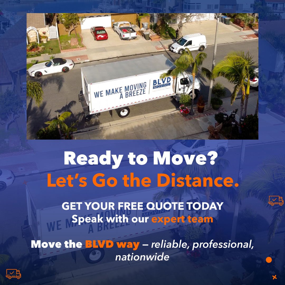
Static and carrousel images

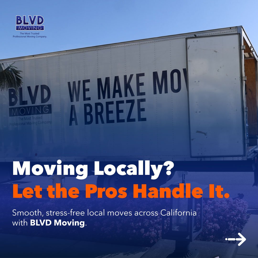
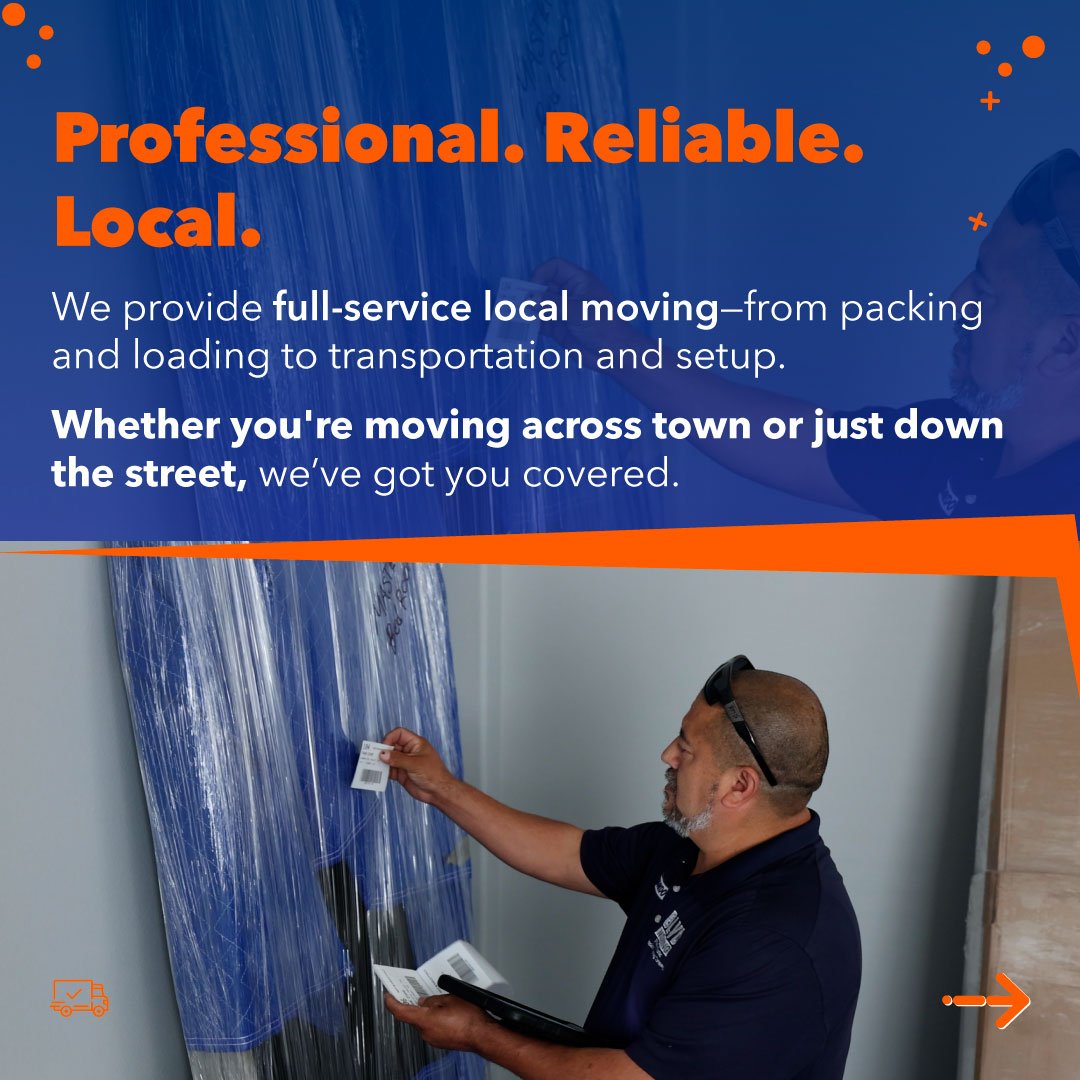
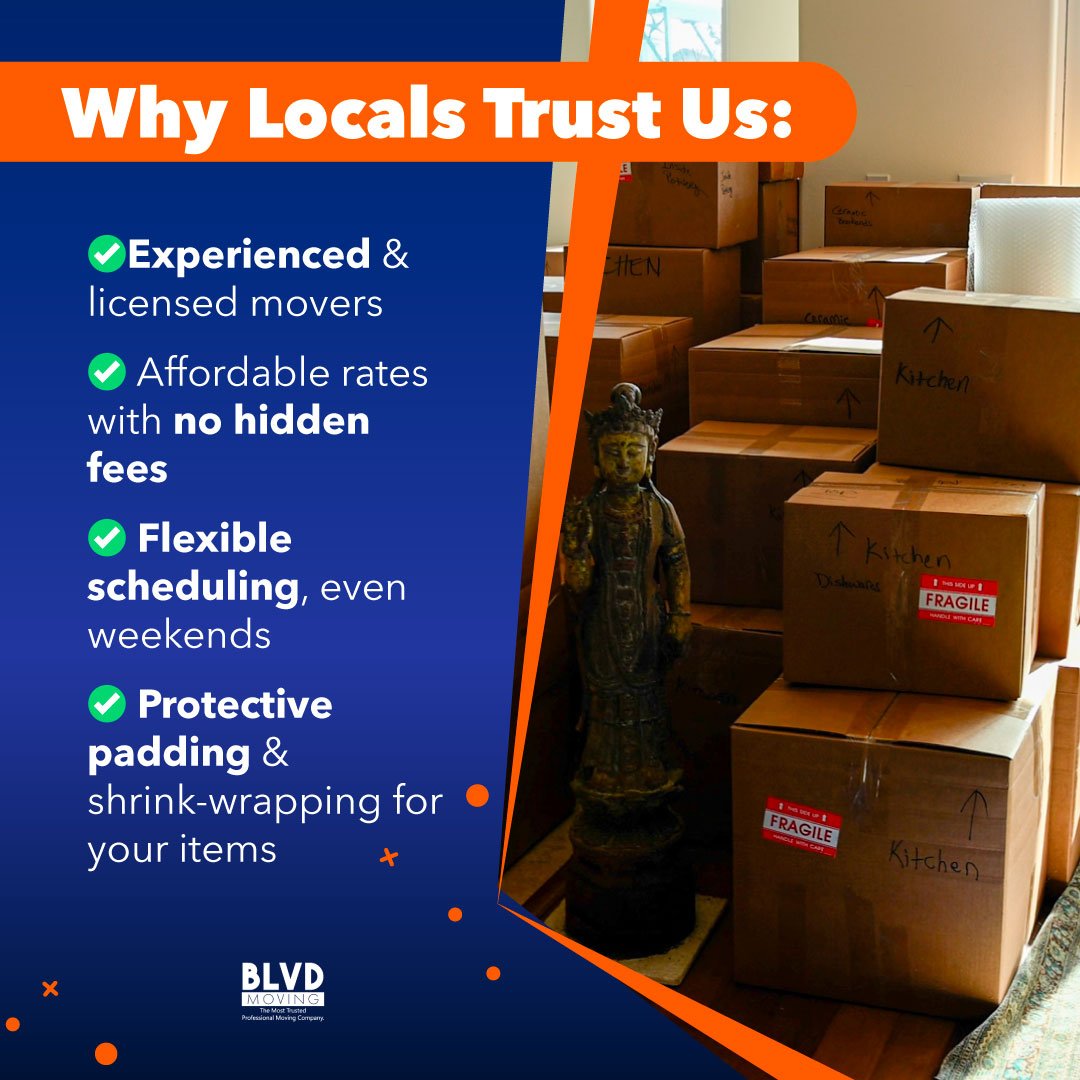
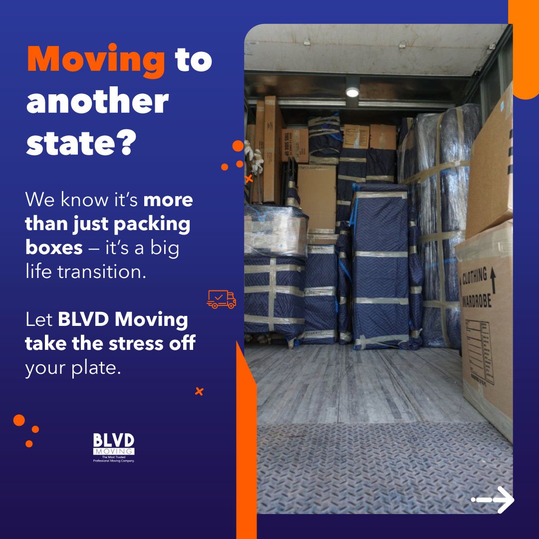
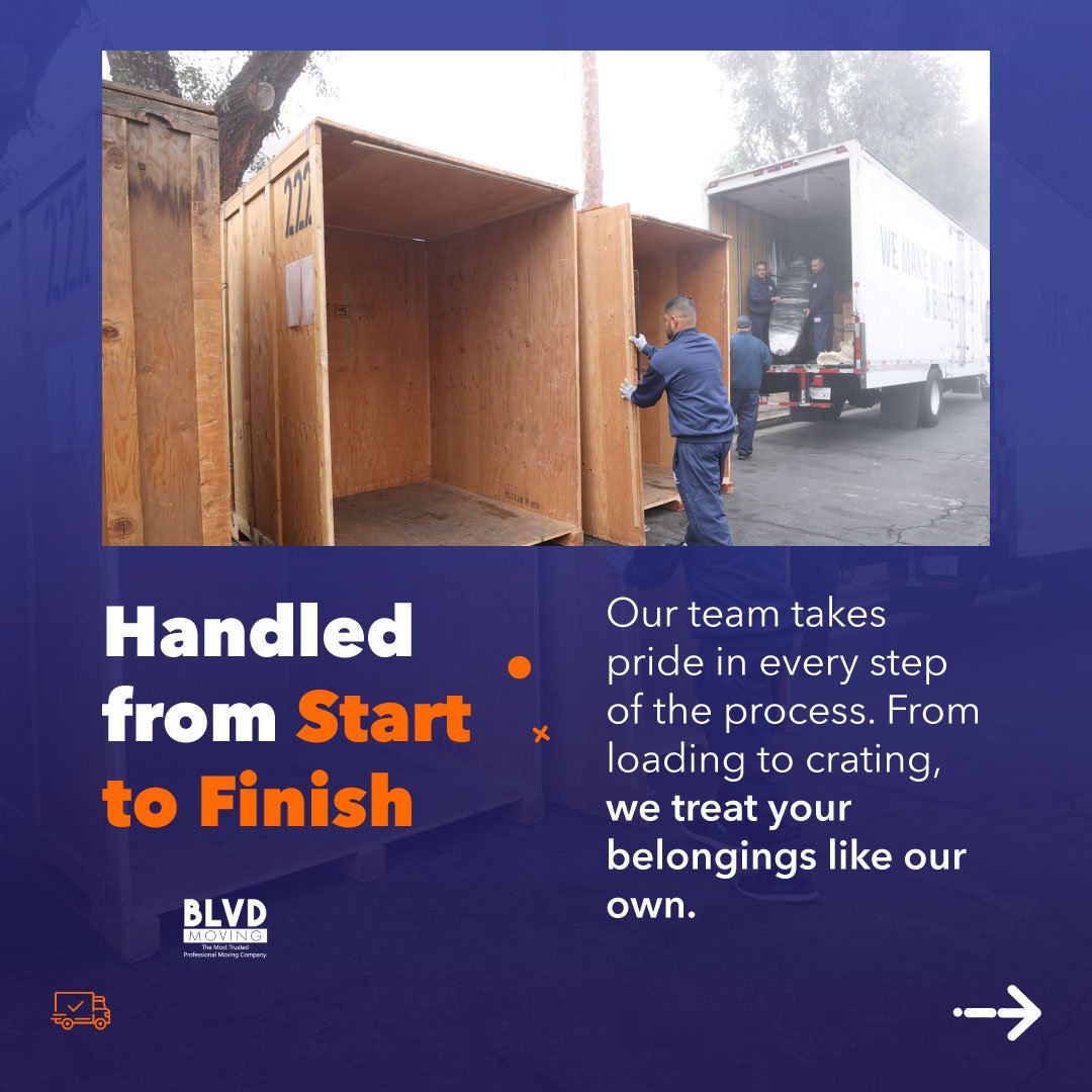


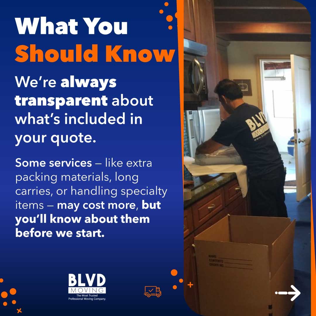
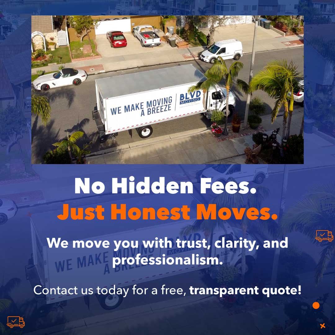
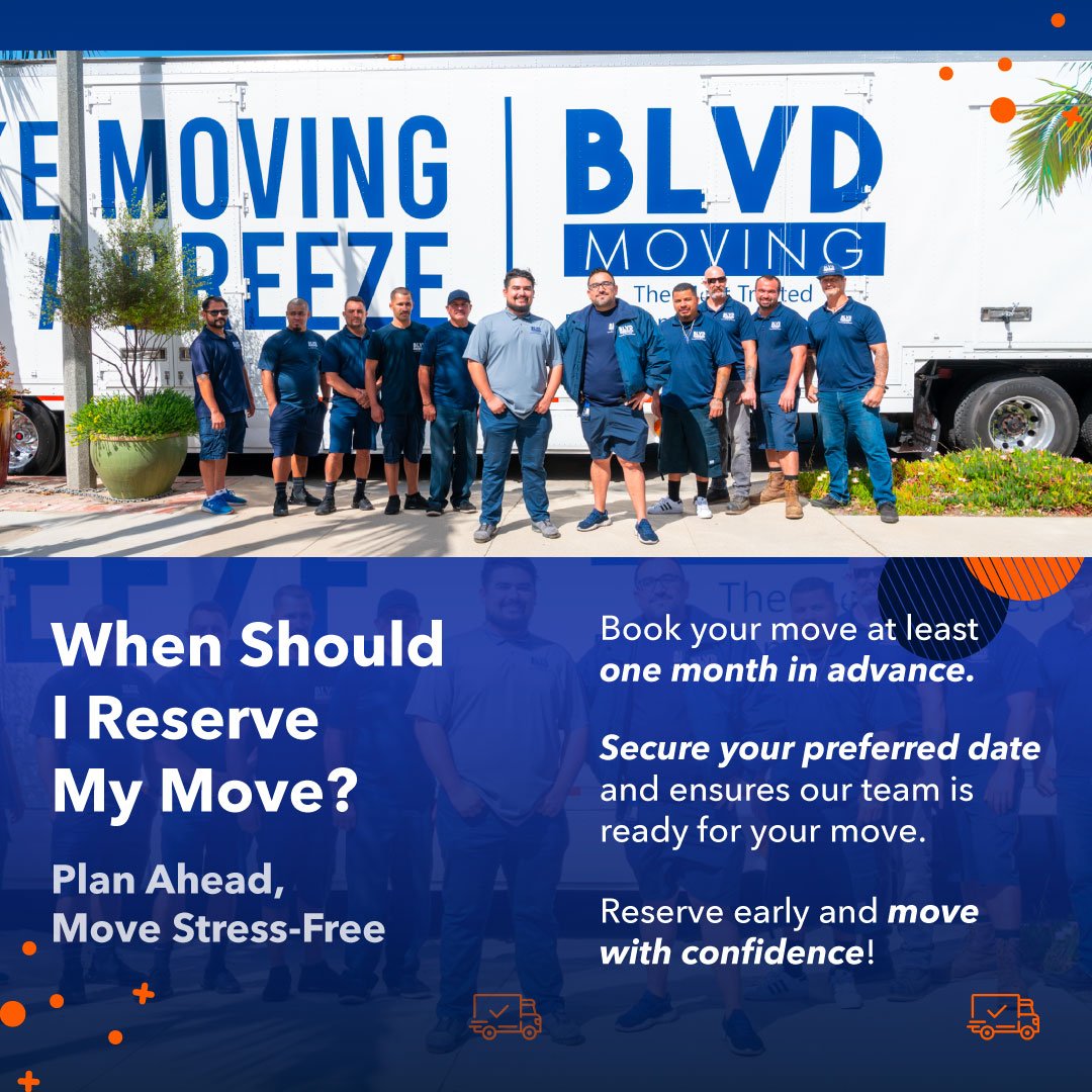
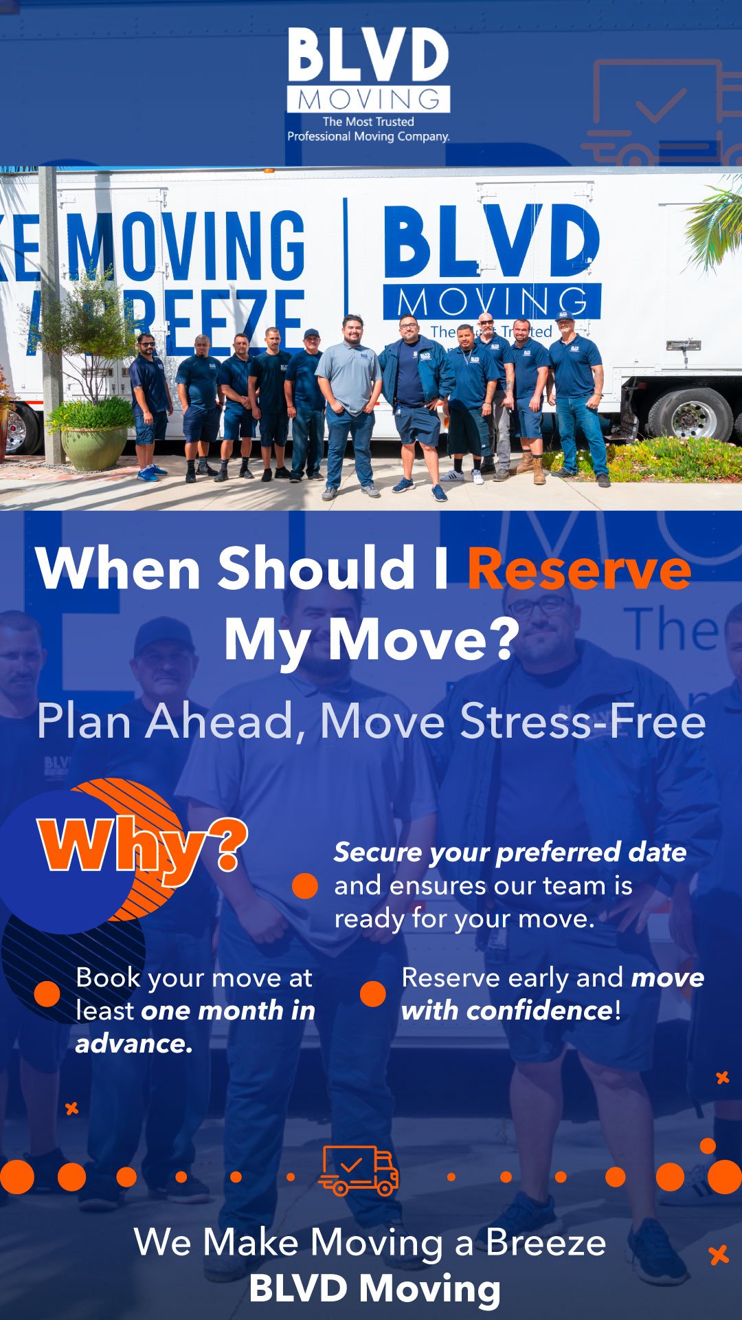
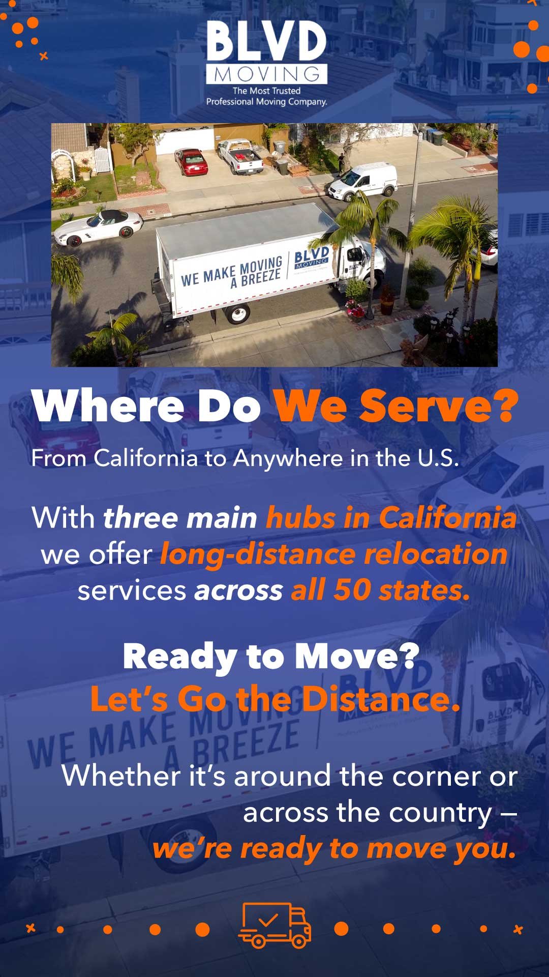
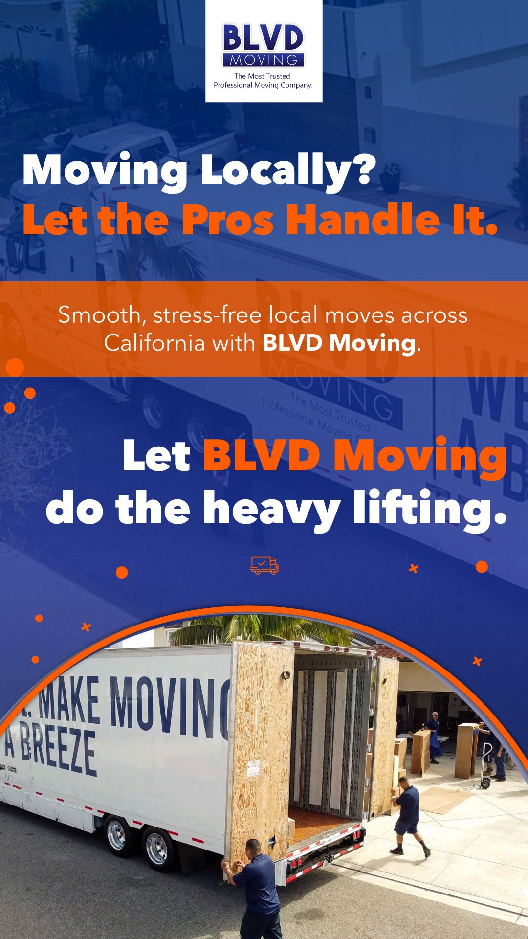
Stories (vertical design)
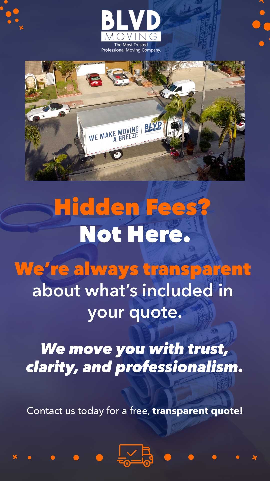
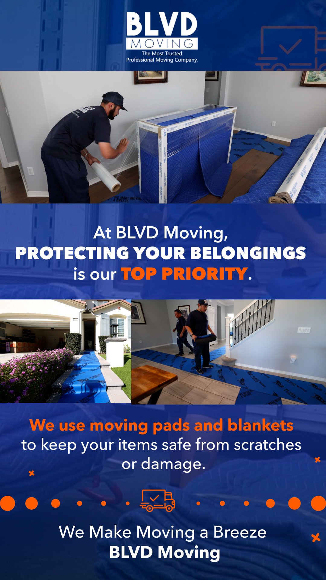
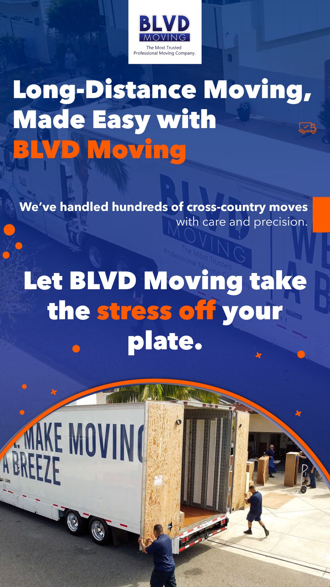
Motion graphics (reels and Tiktok videos)
AM Breakfast & Sweets
- Category: Brand Identity & Social Media Design
- Role: Visual Identity & Digital Designer
- Year: 2025
Overview:
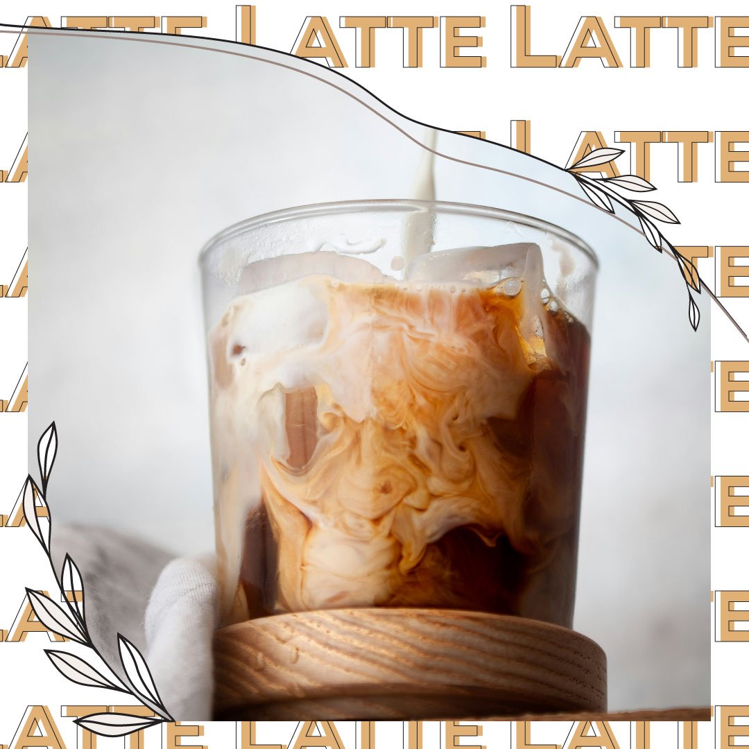
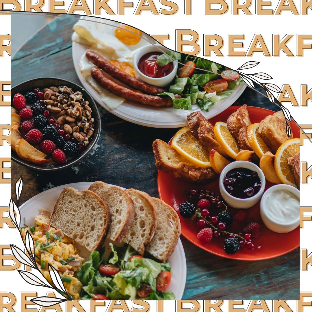
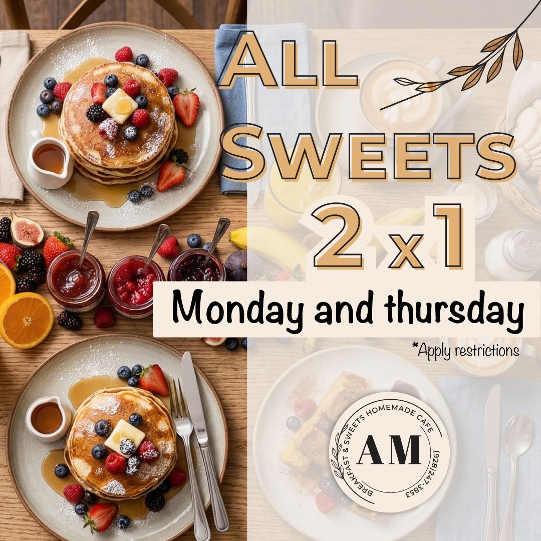
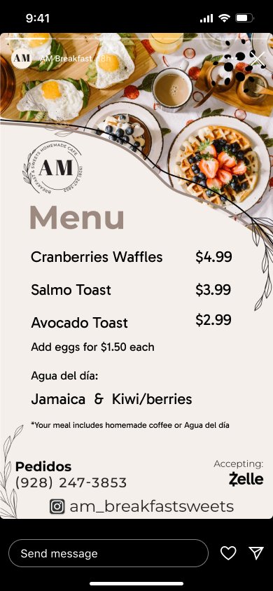
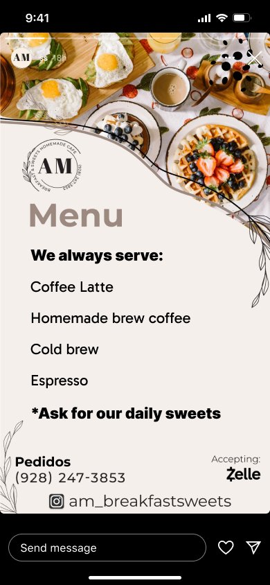
Compact visual identity and dynamic social template system for a delivery-first coffee and breakfast brand. Designed a flexible Instagram story framework that streamlined daily menu updates and turned direct messages into a frictionless sales channel.
Instagram image grid
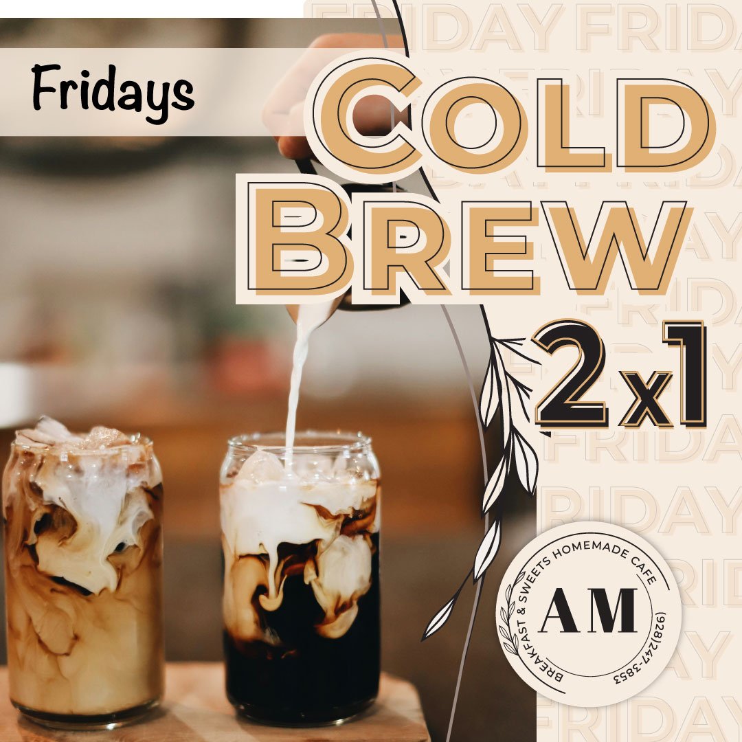
Menu
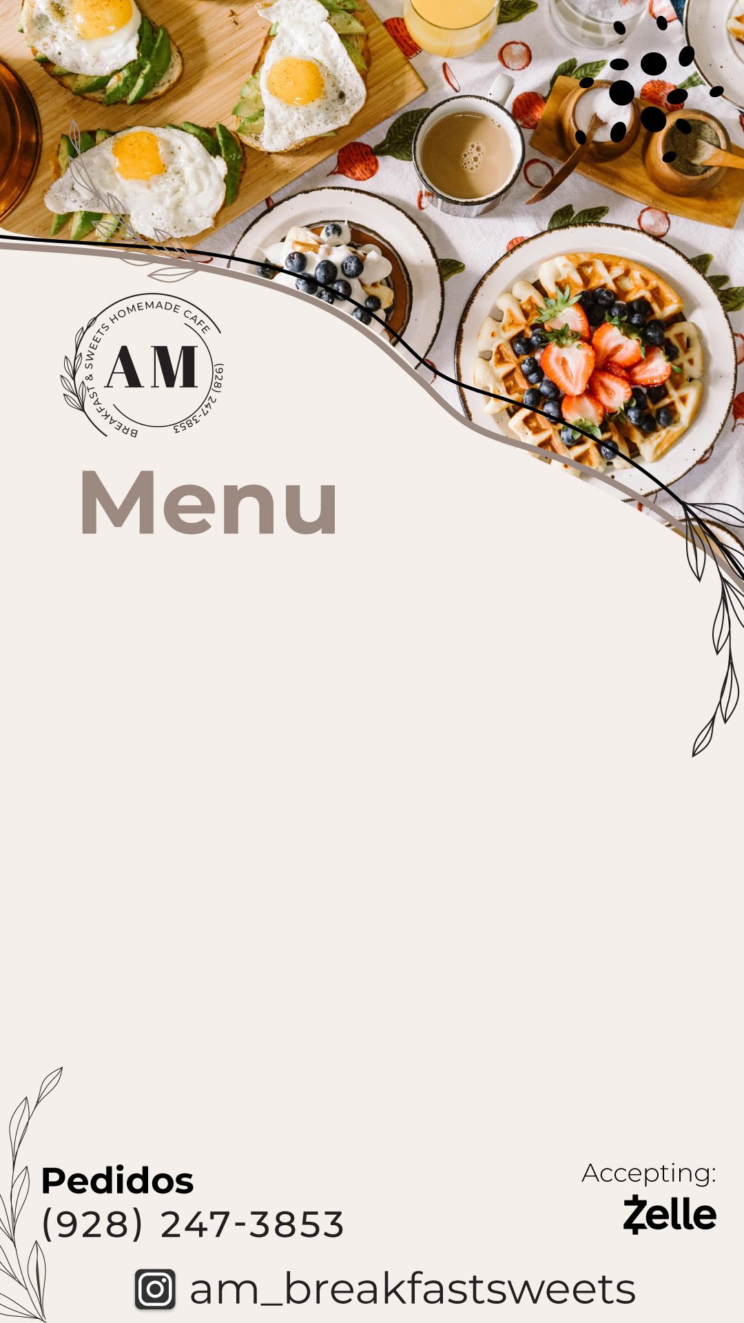
Instead of rigid, static graphics, I designed a modular template for daily Stories. The layout featured clear text zones and optimized contrast, allowing the AM Sweets & Coffee team to overlay the daily menu text directly within Instagram’s native interface.
Print media
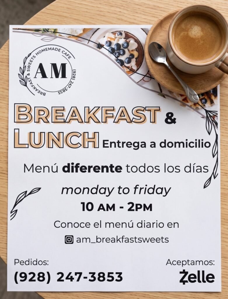
Print flyer and labels for the food design.
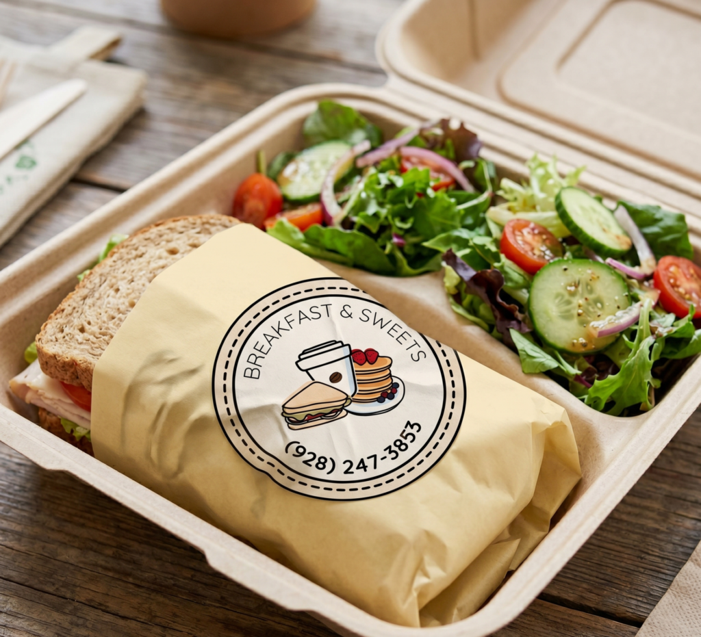
*Visual mockup / Pre-press simulation for portfolio presentation purposes.
Selected Collateral & Marketing Pieces