


Kaligent | Visual Identity & Systems Design
Overview
Following its spin-off and strategic alignment with TGen, Kaligent required a comprehensive visual identity and brand ecosystem from scratch. As the Brand Lead and Visual Designer, my objective was to establish a digital-first, data-driven identity that bridged the gap between advanced biotechnology and human-centric clinical clarity. The challenge was projecting corporate authority while visually separating the new entity from its parent brand without losing scientific credibility.
- Role: Lead Visual & Brand Designer
- Discipline: Brand Identity, Visual Design System, Design Guidelines & Collateral
- Industry: Biotechnology

The Challenge
Brand Transition: Establishing an independent visual presence for a biotechnology spin-off under the umbrella of a prestigious research institute (TGen).
Ecosystem Consistency: Eliminating fragmented visual assets across internal communications, corporate decks, and digital touchpoints.
Balancing Complexity: Translating highly technical genomic and clinical data into a clean, accessible, and authoritative aesthetic.
Design Strategy & Execution
1. Brand Architecture & Logo Design:
• Developed the foundational visual identity, creating a custom isotype and logo architecture centered around precision, connectivity, and data-driven solutions.
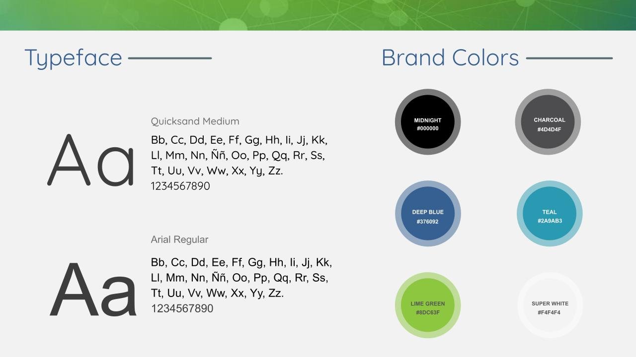
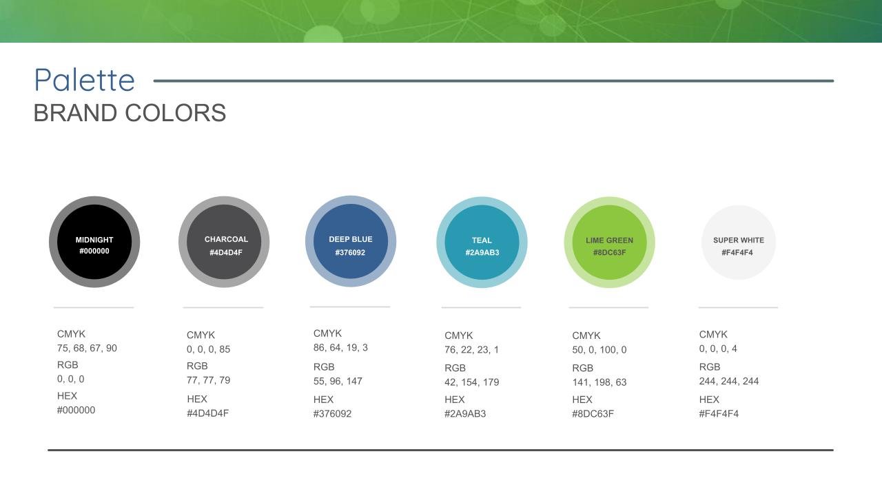
• Built a specialized technical color palette and typography rules tailored for digital environments and data density.
Brand Ideation & Concept Development
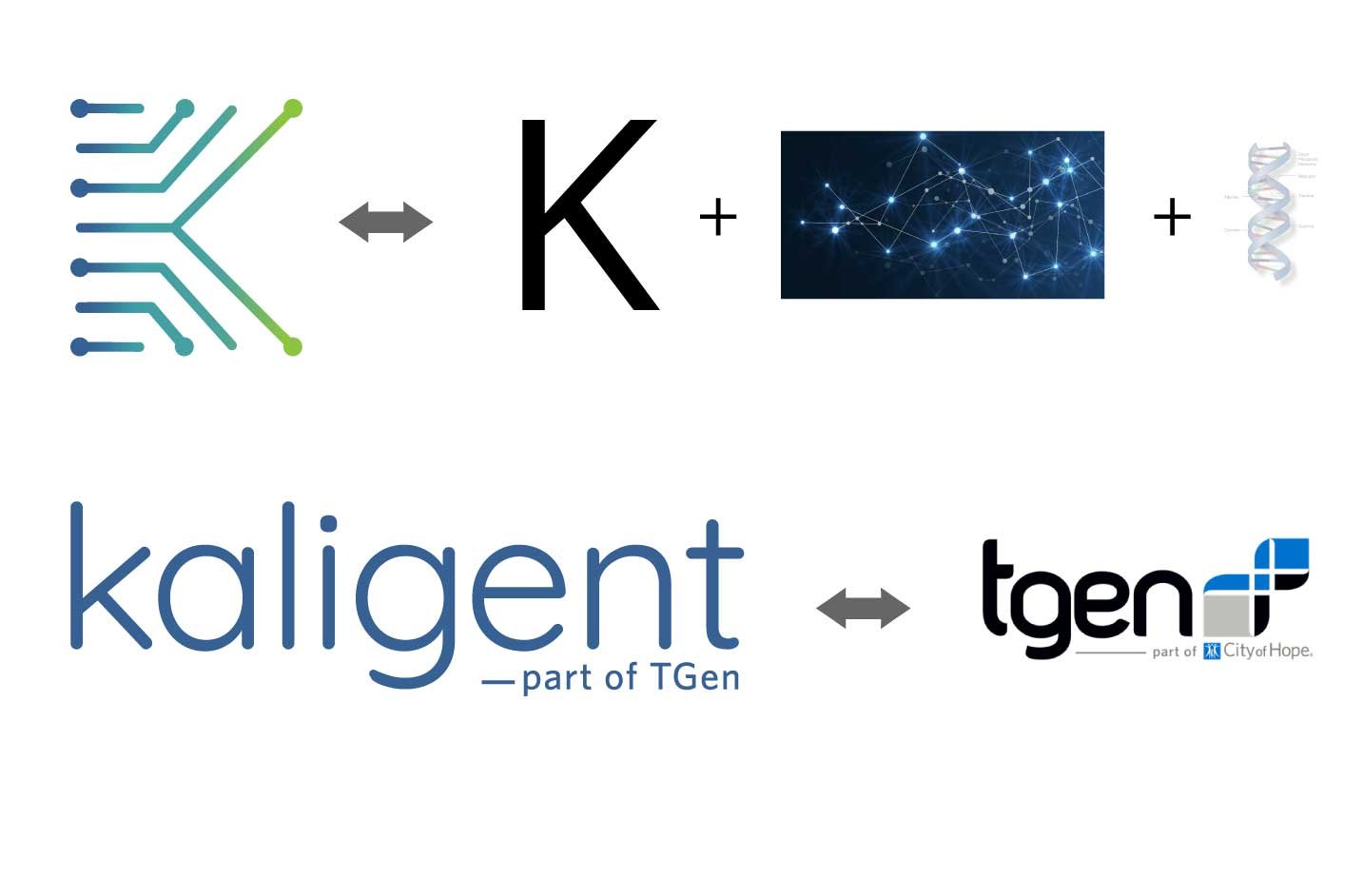
Designing the visual identity for Kaligent required balancing the deep scientific authority of its parent company, TGen, with a modern, digital-first presence in the biotechnology sector. The branding process explored numerous directions before arriving at the final core concept: «From Chaos to Code»—representing the transformation of complex genomic data into precise clinical insights.
1. Conceptual Exploration & Sketching
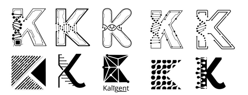
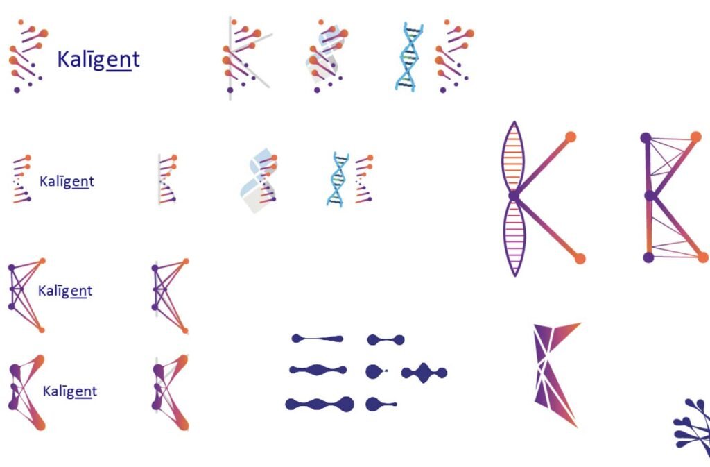
- The Journey to the Symbol: We tested multiple design paths, exploring circuit-board patterns, cellular structures, and modular grids. The breakthrough came by abstracting the letter K and merging it with a structural representation of a DNA helix.
- Geometric & Organic Balance: Early iterations looked at varying weights, vector networks, and node connectivity to ensure the symbol felt both technological and human-centric.
2. Color Palette & Typography
- Heritage Meets Innovation: To respect the corporate connection, we adopted the core deep-blue tones from TGen as our primary foundation.
- Vibrant Contrast: A sharp, vivid green was introduced as a secondary accent to represent vitality, precision, and forward-thinking life sciences.
3. Architecture & Brand Tagline
- Affiliation Structure: Following the convention of the parent brand, the name Kaligent was paired with the official descriptor «—part of TGen», establishing immediate institutional credibility while maintaining distinct market positioning.
Comprehensive Brand Guidelines & Iconography
To ensure long-term scalability and consistent cross-platform execution, the finalized visual system was compiled into a comprehensive set of brand guidelines. This included standardizing the color system, typography hierarchies, and component usage.

2. Standardized Documentation Systems:
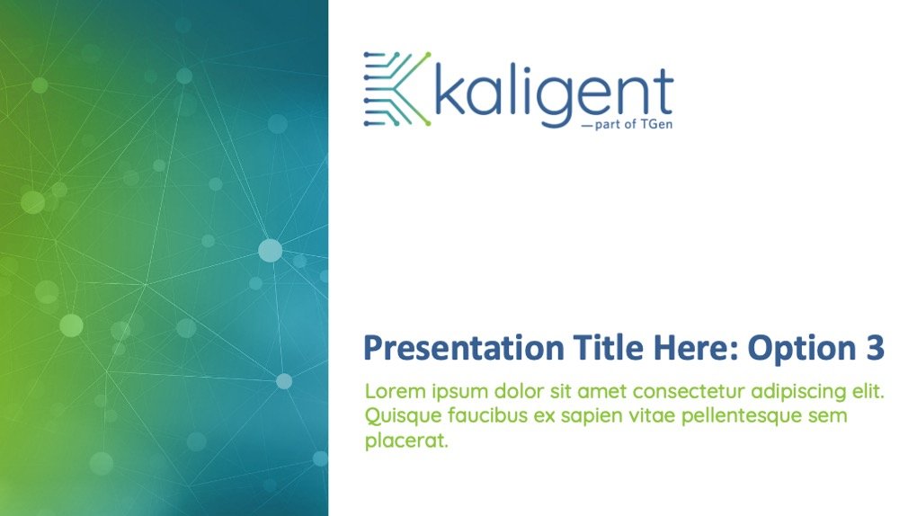
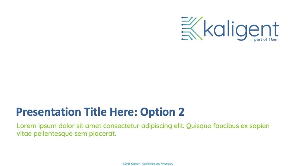
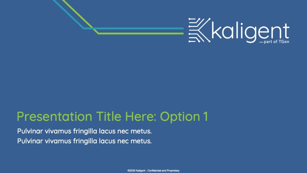
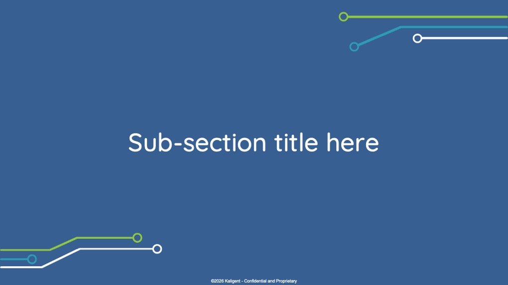
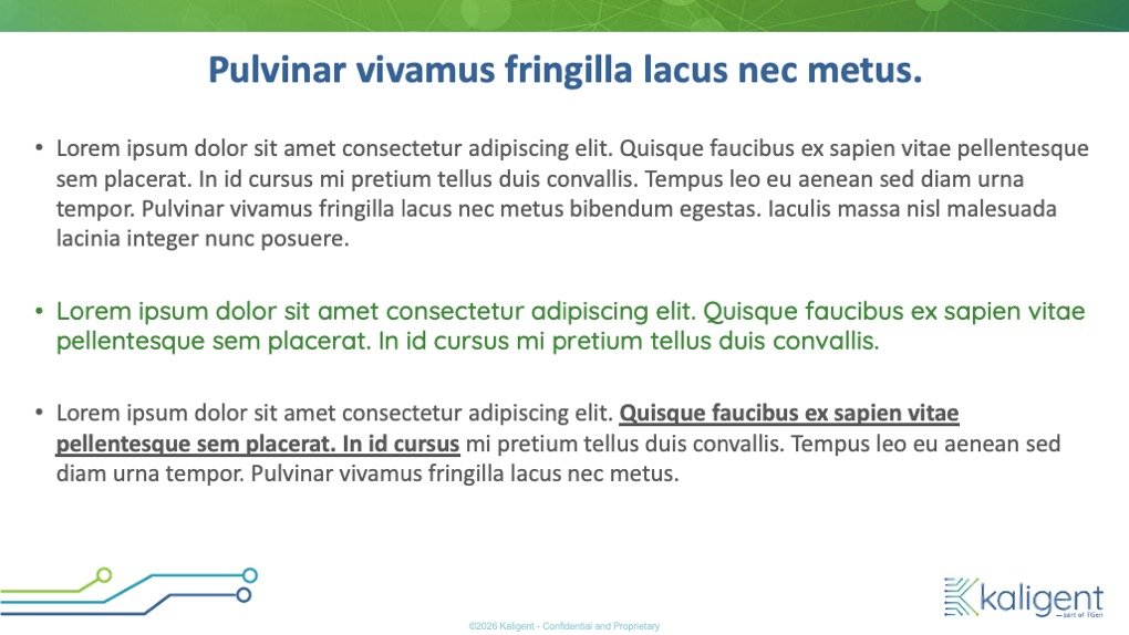
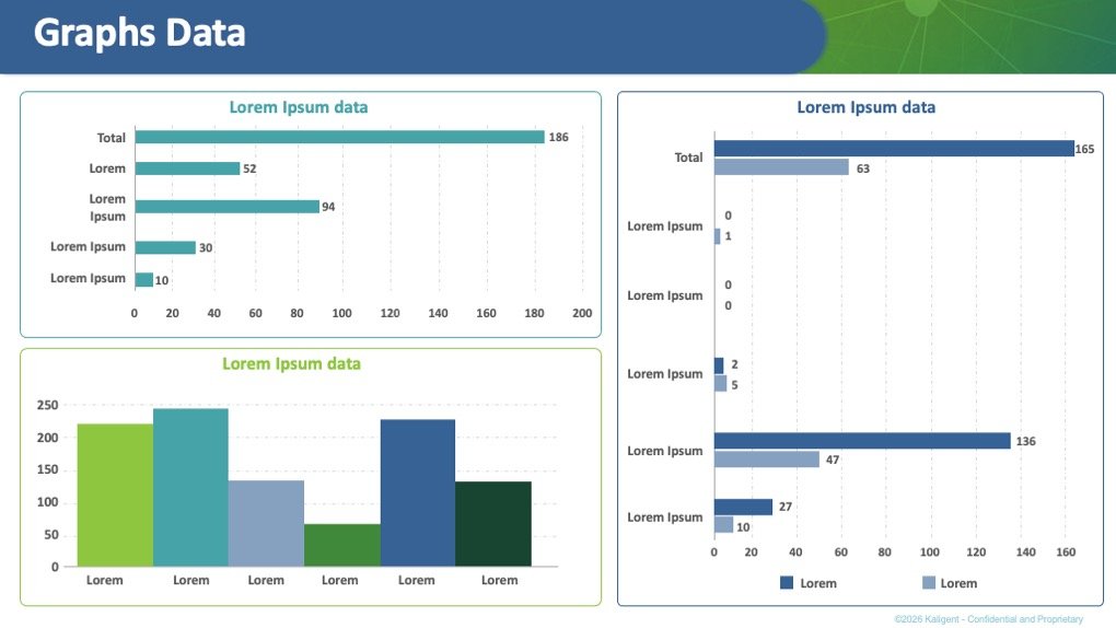
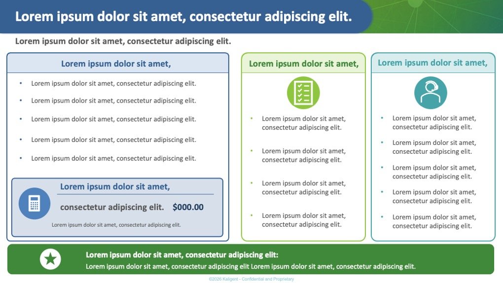
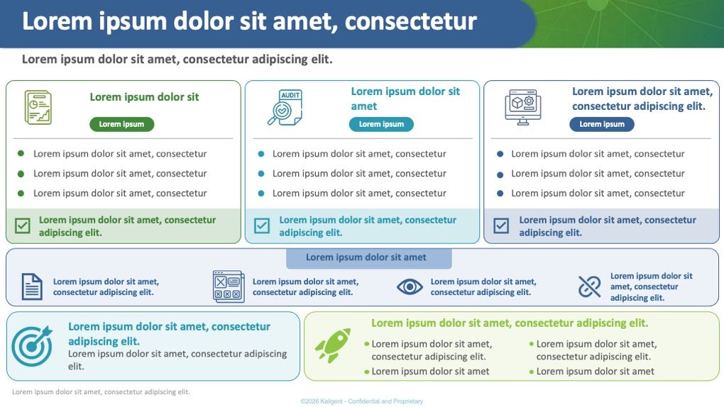
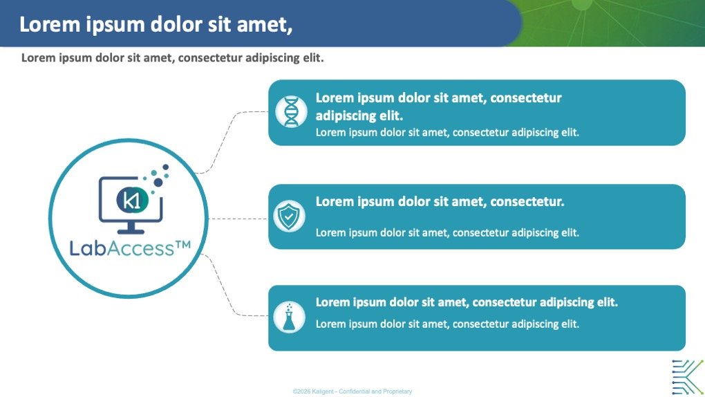
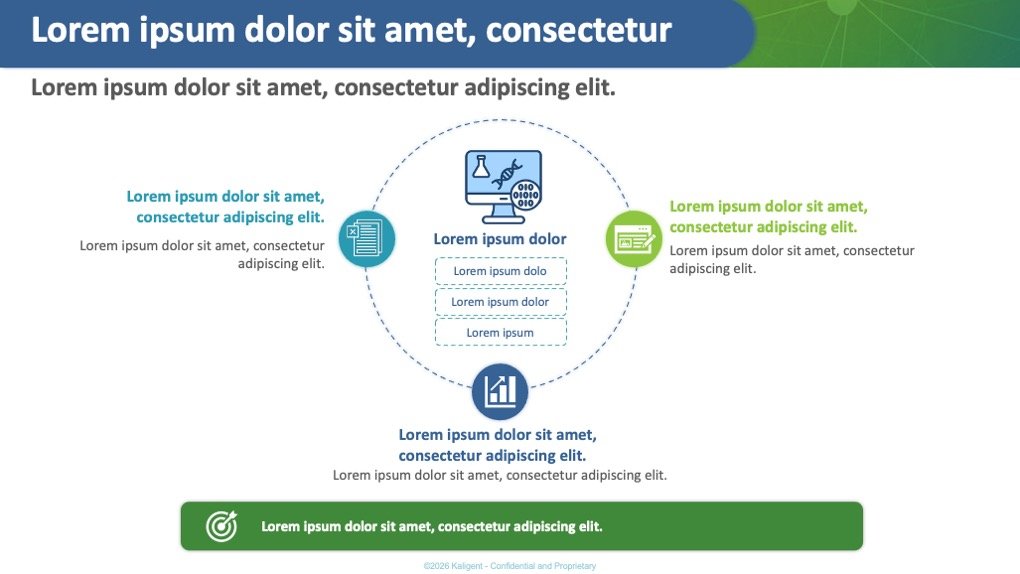
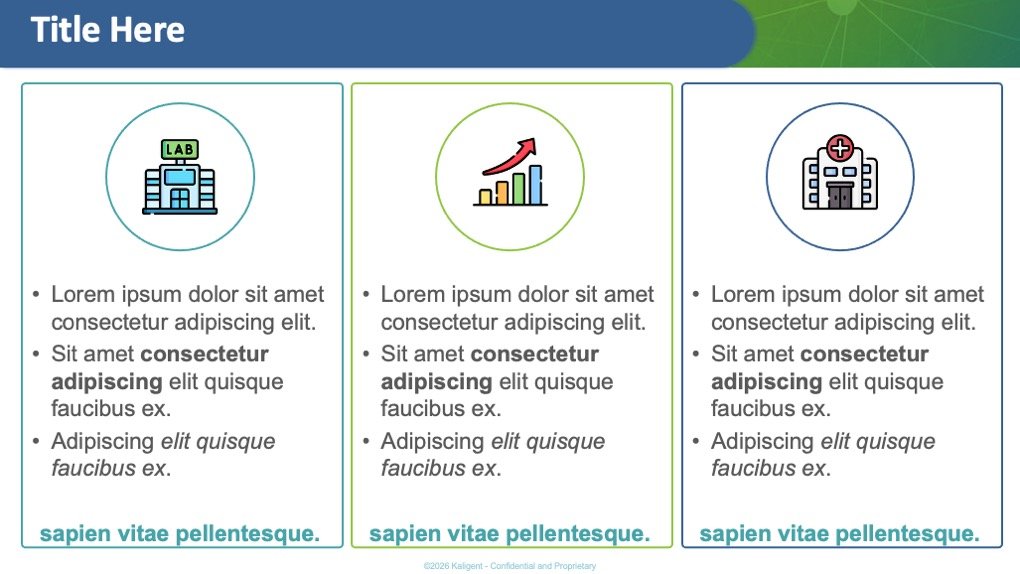
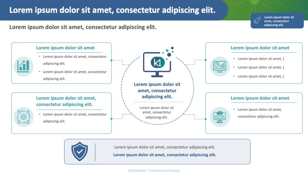
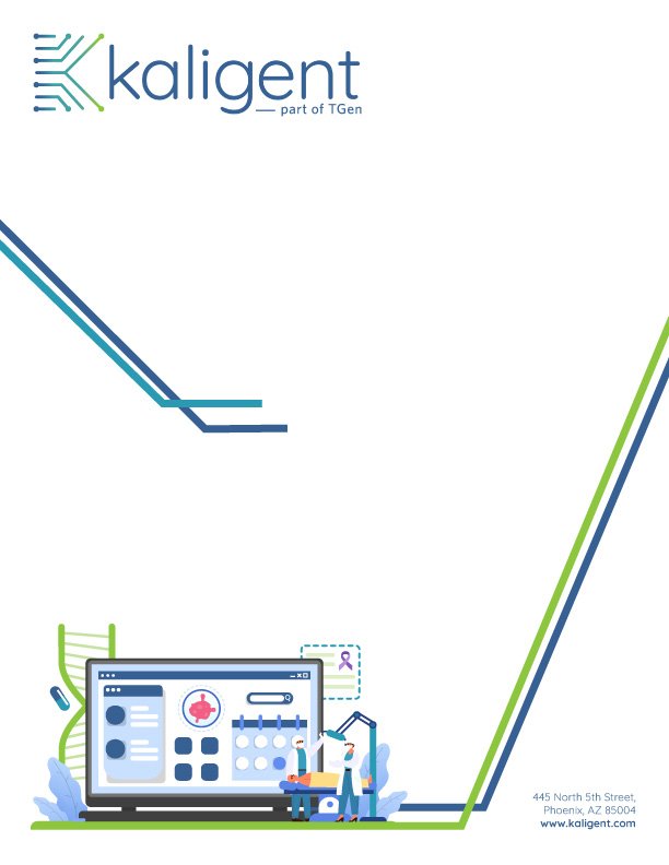
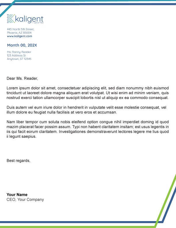
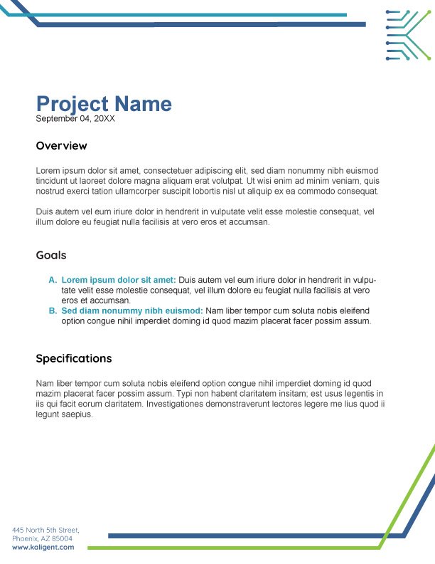
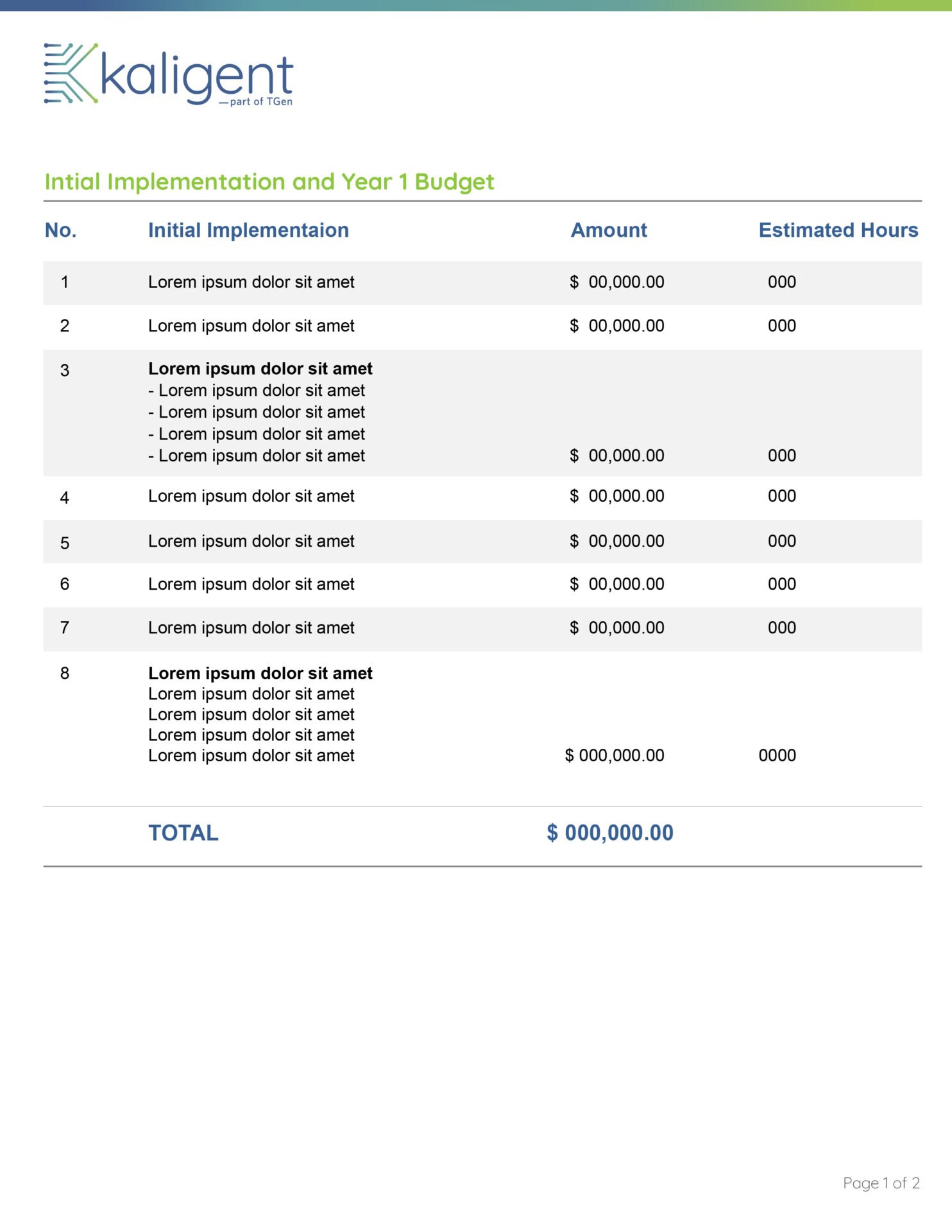
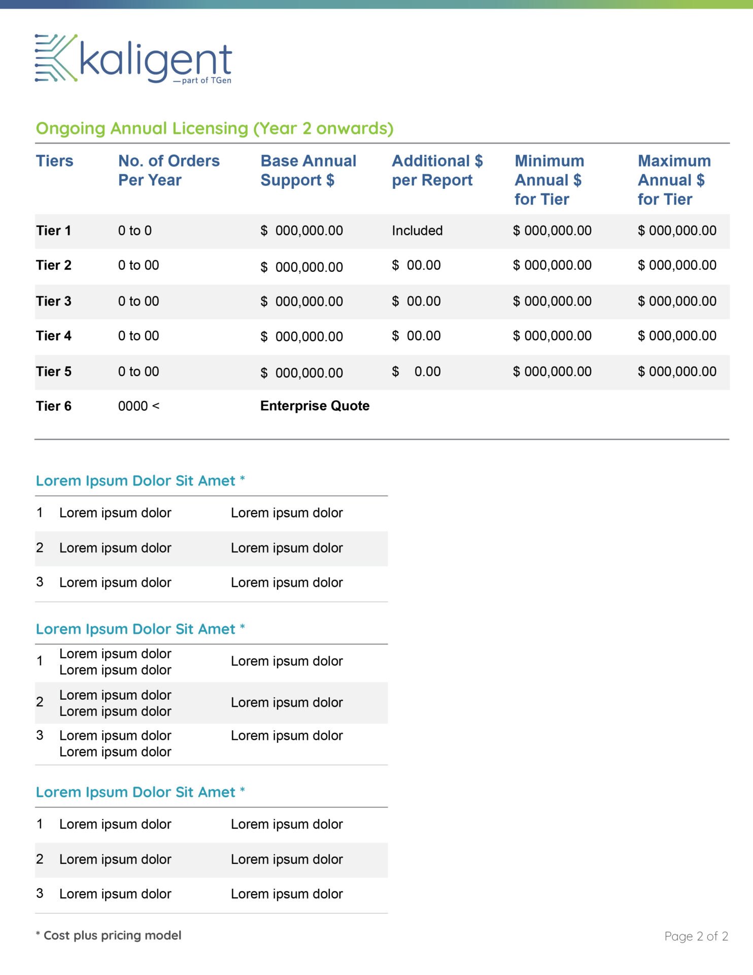
- Designed and deployed standardized corporate templates for PowerPoint and Word, ensuring absolute visual uniformity for executive presentations and technical documentation.
Power Point Template
Word and Budget/Sales Templates
3. Editorial & Corporate Culture:
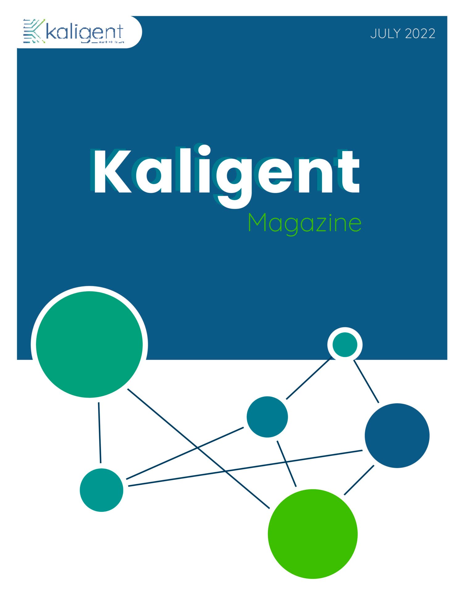
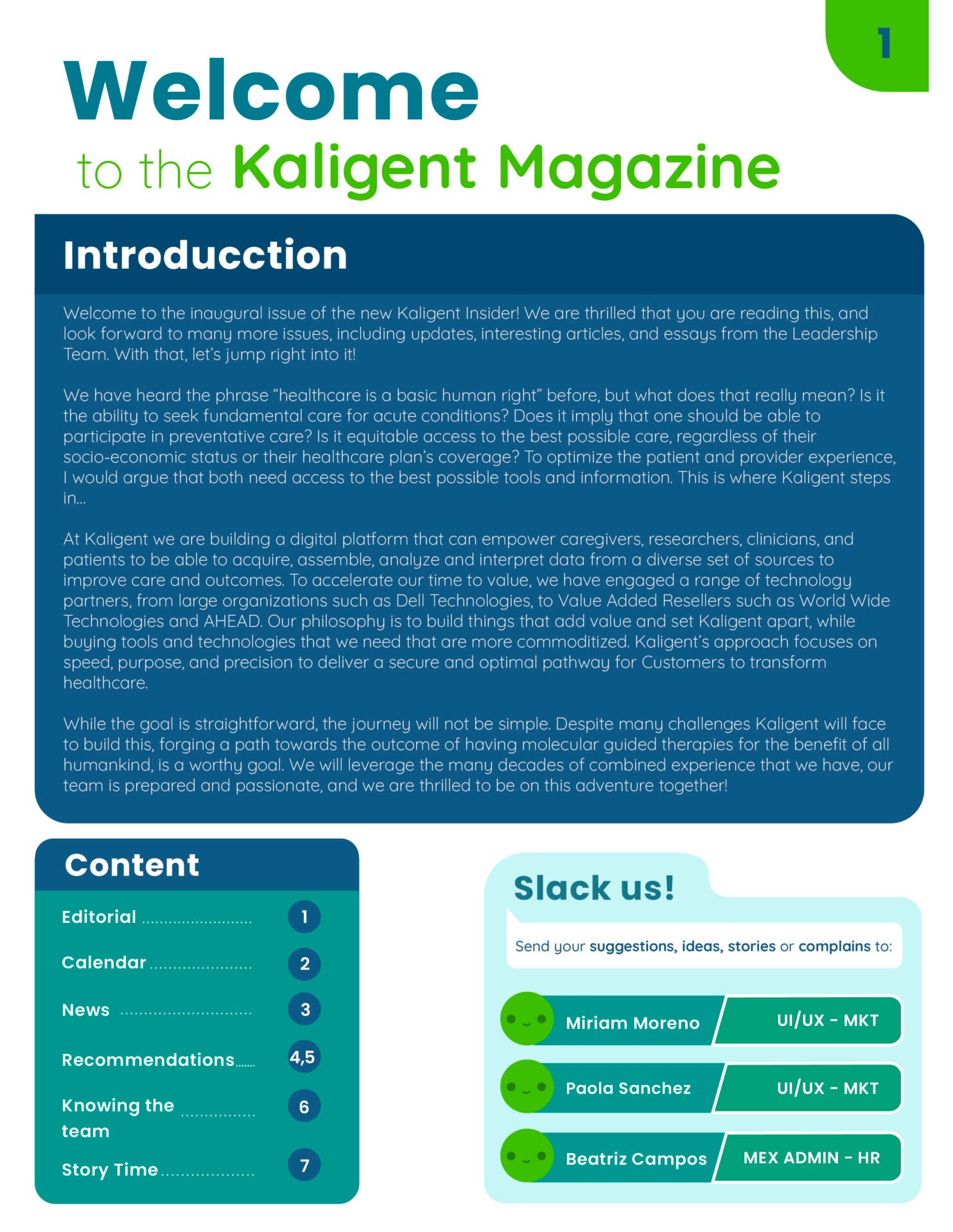
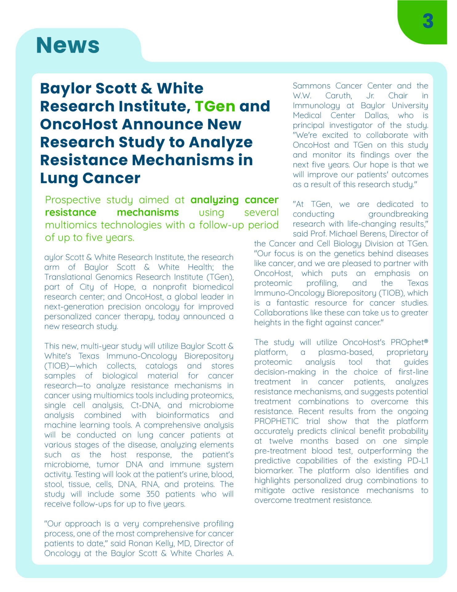
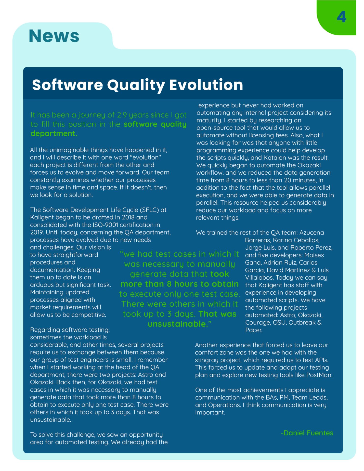
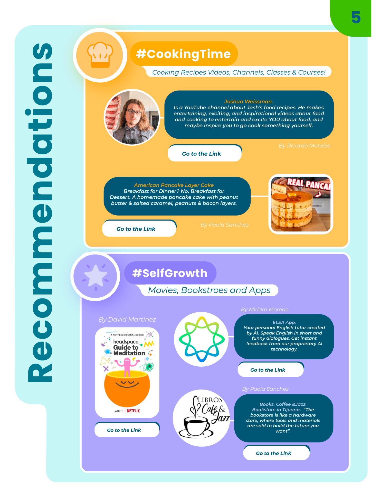
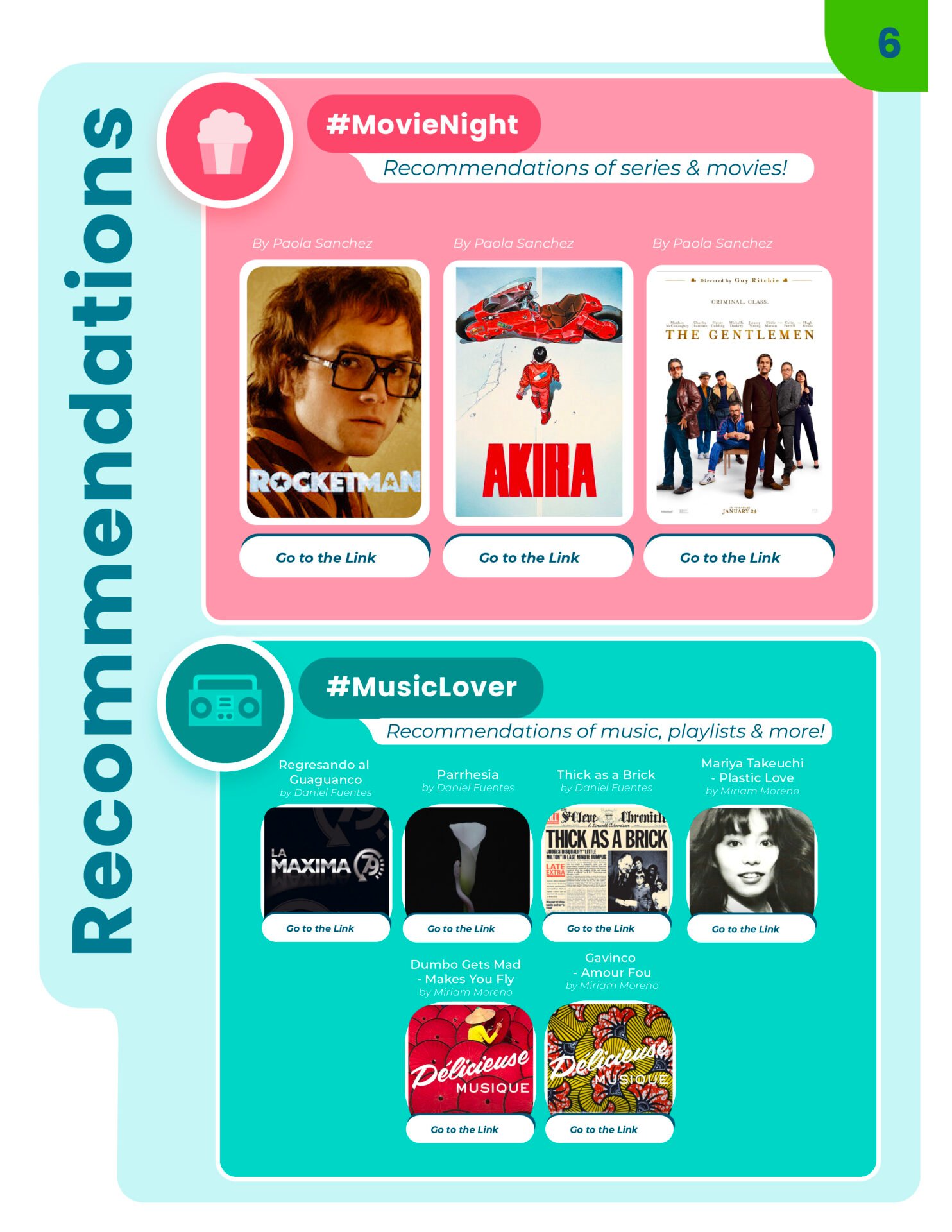
- Conceptualized and designed the institutional internal magazine, establishing structural grids, typography hierarchies, and visual pacing to foster company culture and internal alignment.
Internal magazine

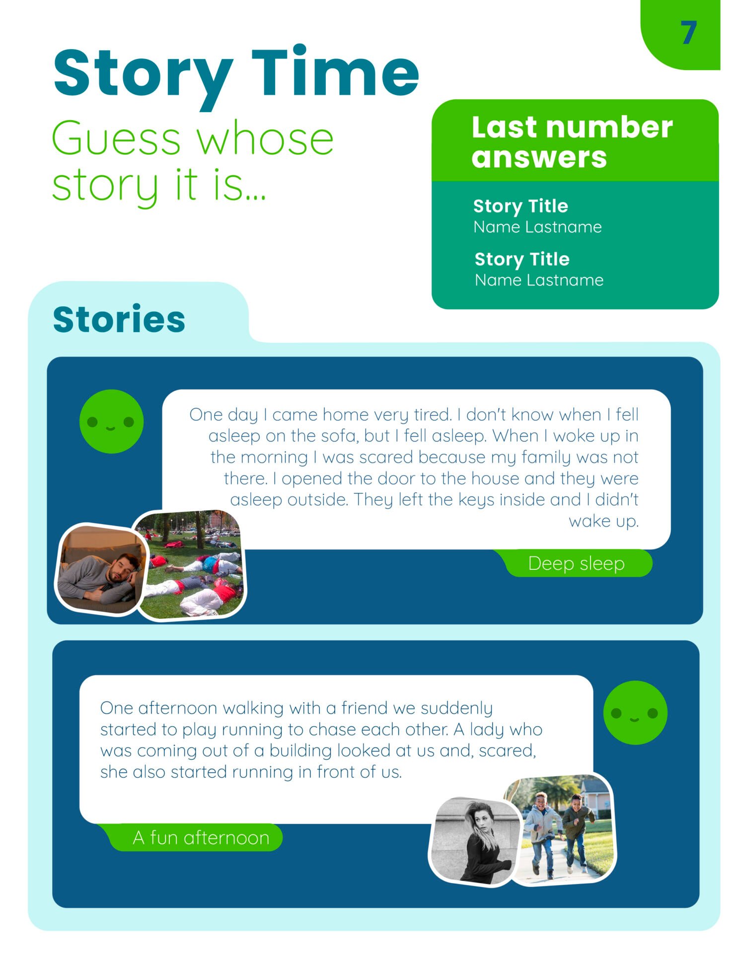
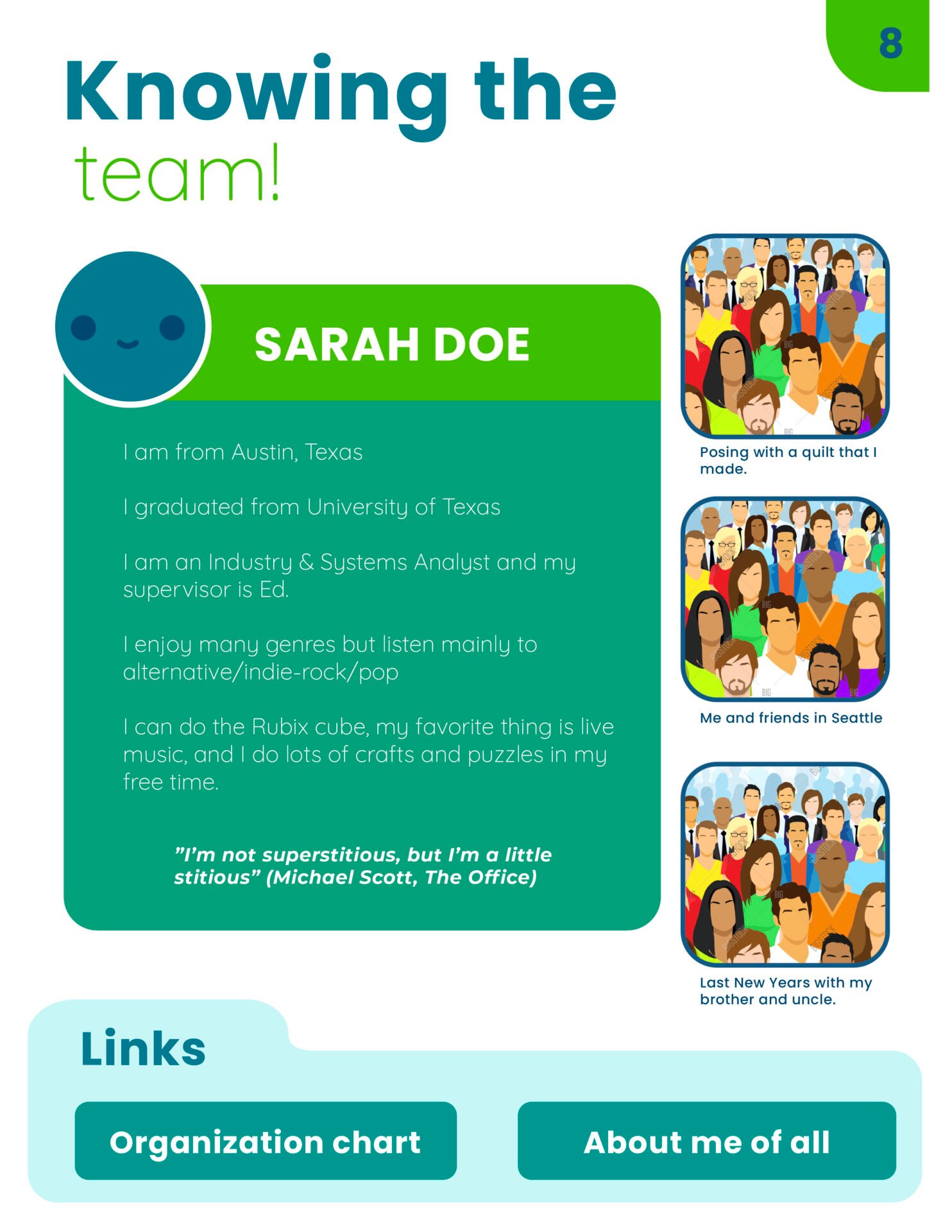
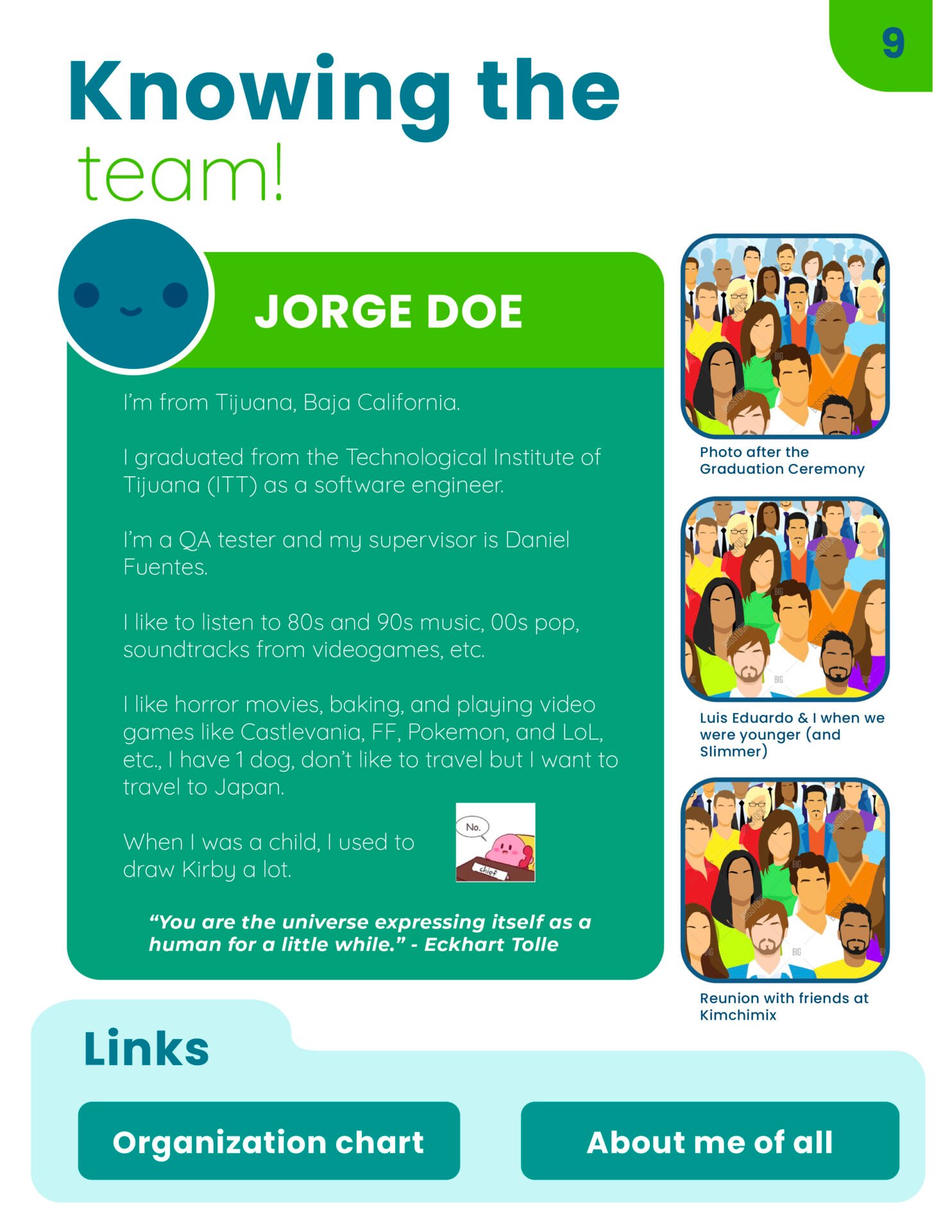
Birthday cards for employees




4. Digital Authority & Communication:
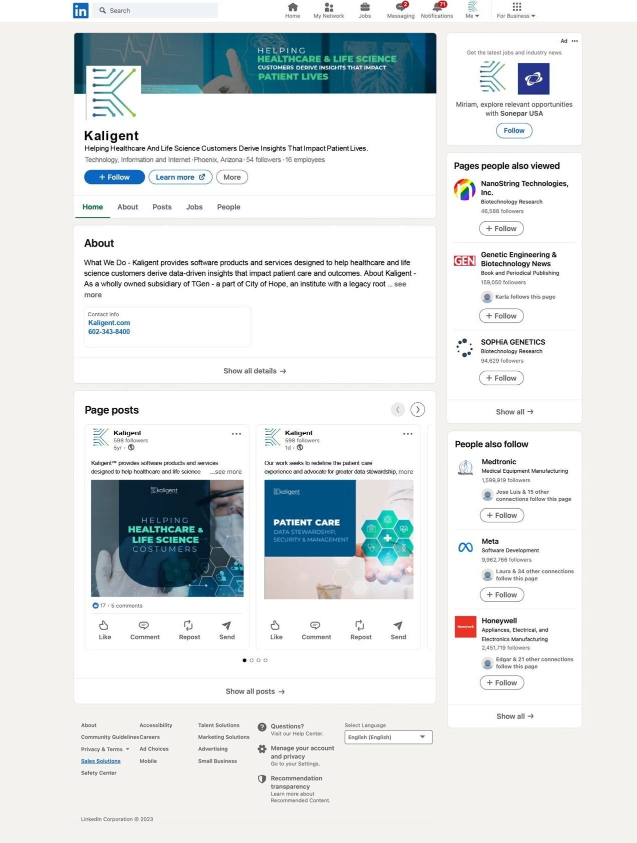
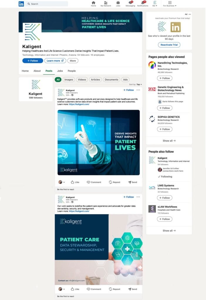
Set up a strategic visual presence on LinkedIn, creating high-impact templates and content guidelines to position Kaligent as a thought leader in the biotechnology and precision medicine sectors.






Social Media covers



Social media examples
Impact & Results
Delivered a cohesive, scalable brand ecosystem that unified all internal and external communications.
Significantly reduced friction in document production by equipping teams with robust, professional design templates.
Positioned Kaligent with a sleek, modern visual authority that resonated with stakeholders, clinicians, and the tech-biotech market.